

Driving 60%+ conversion growth across Buy, Sell and Send Flows
Cryptocurrency trading was the primary revenue driver across our active African markets, and we identified a significant drop-off beginning at the amount entry stage of the trade flow. This signalled a critical conversion gap, prompting deeper investigation into user behaviour, friction points, and the underlying causes impacting completion rates.
ROLE
Lead Product Designer
TEAM MEMBERS
Ryan Jales
Head UX research and writing
TOOL STACK


The problem(s)
High dropoff rates across trade flows
On analysing the drop off rates on Mixpanel, we were on a high rate of 35.23% for the sell flow and 38.92% on the buy flow. These numbers were discovered on the “enter amount” screen and really needed to be fixed or at least investigated.
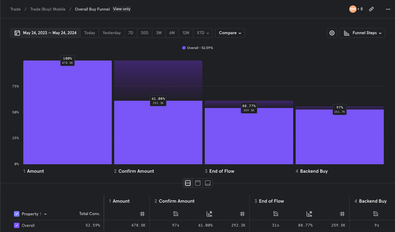

Drop off rates - Buy flow
Redundant steps
Looking across the trade flows, it had so many redundant screens. Screens that we earlier thought would help with the overall experience but rather made things harder to interact with and even understand
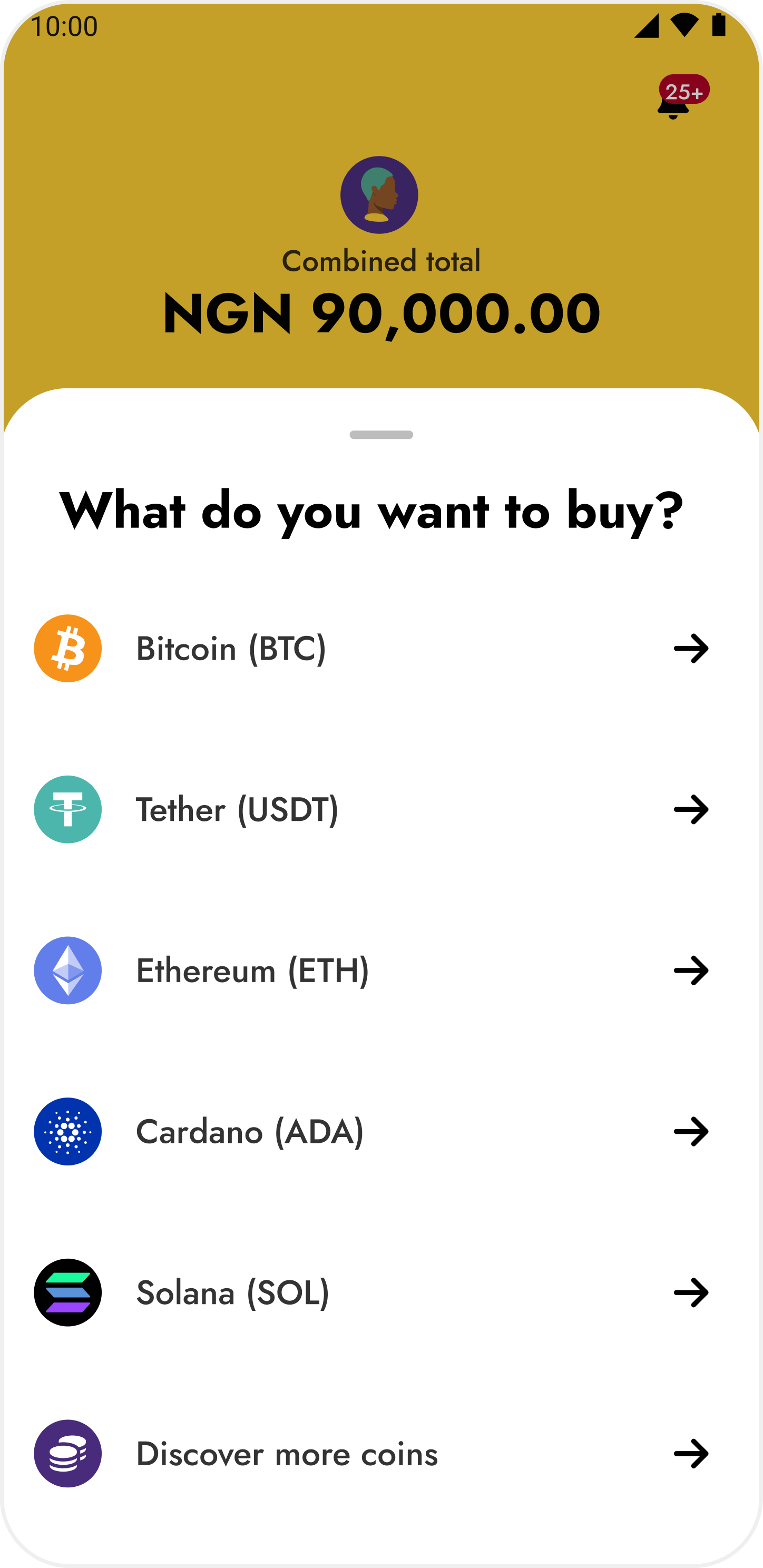
“What do you want to buy” bottom sheet
Lack of clarity
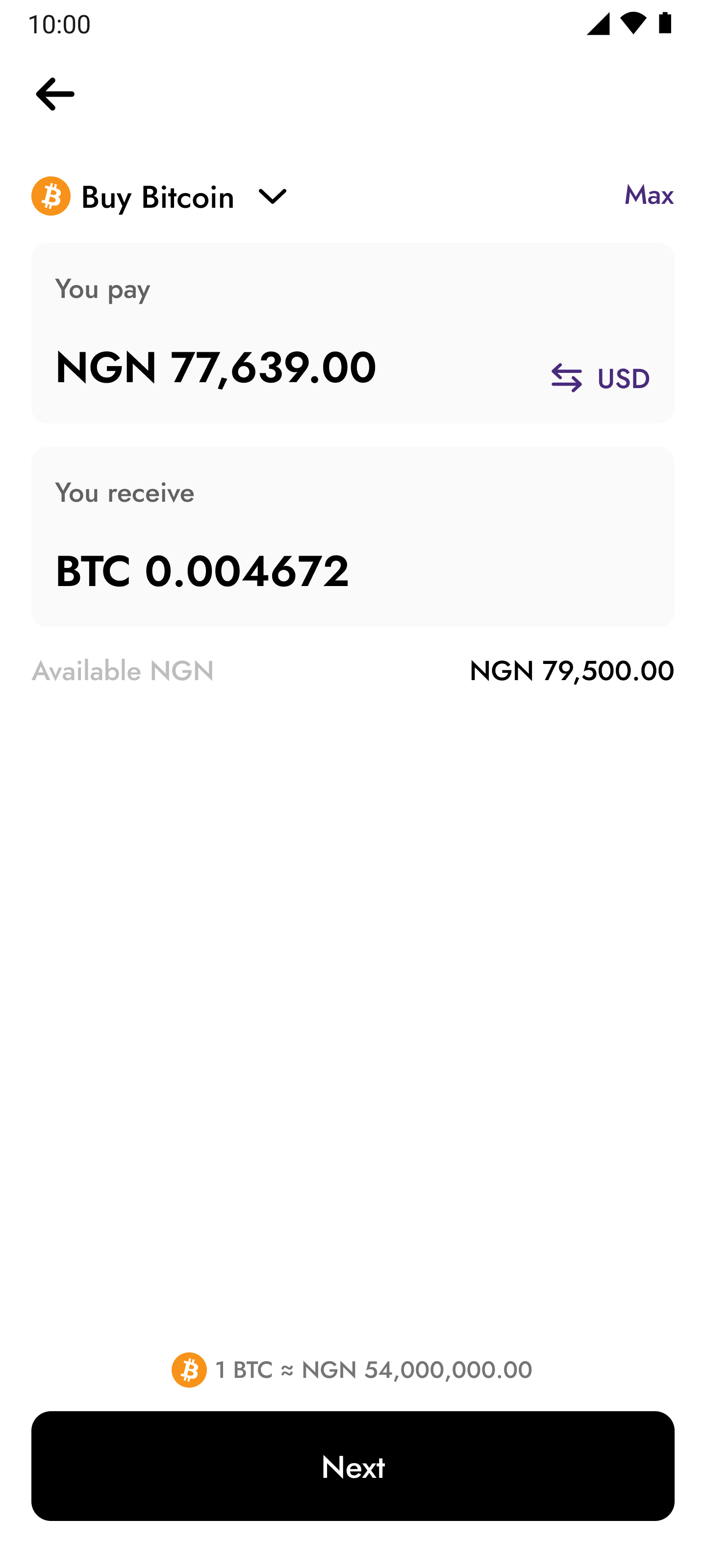
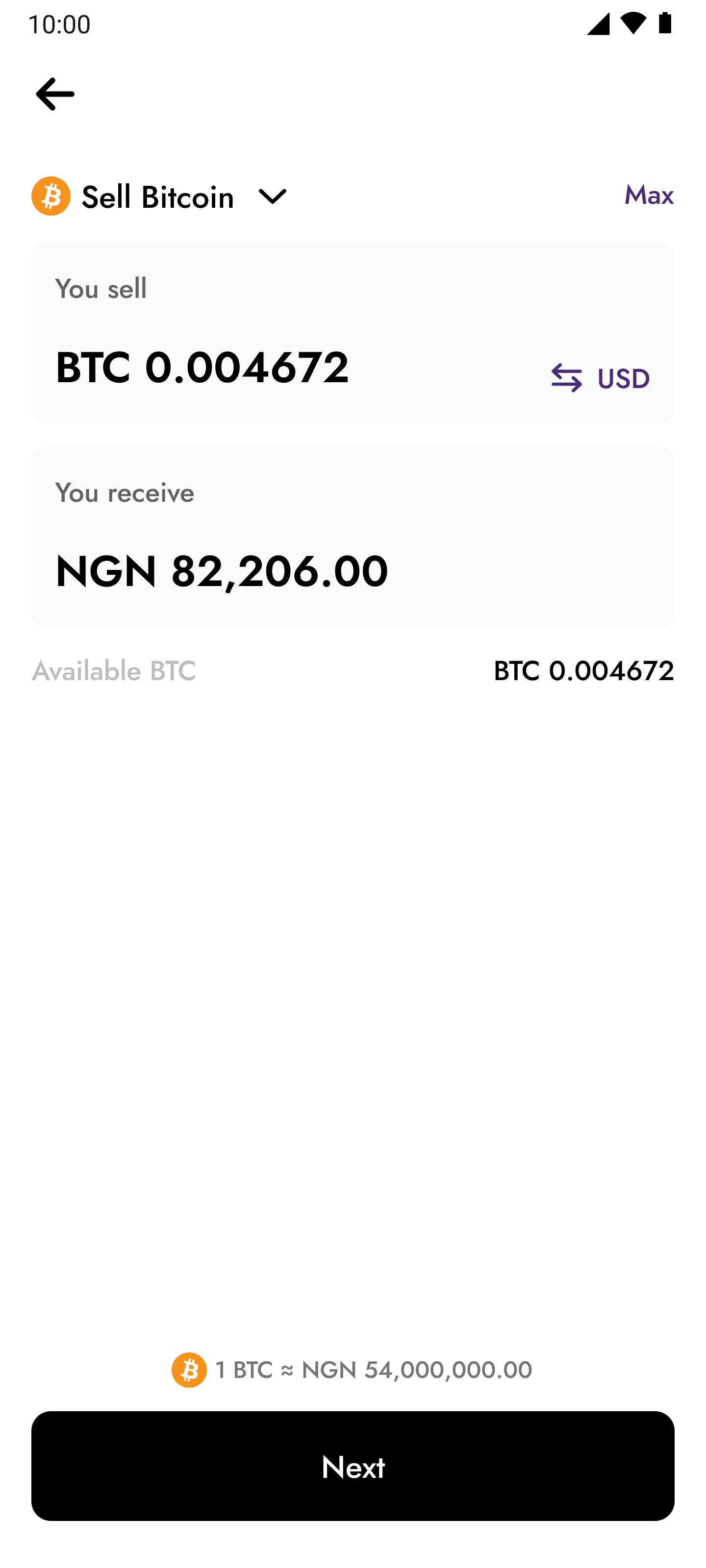
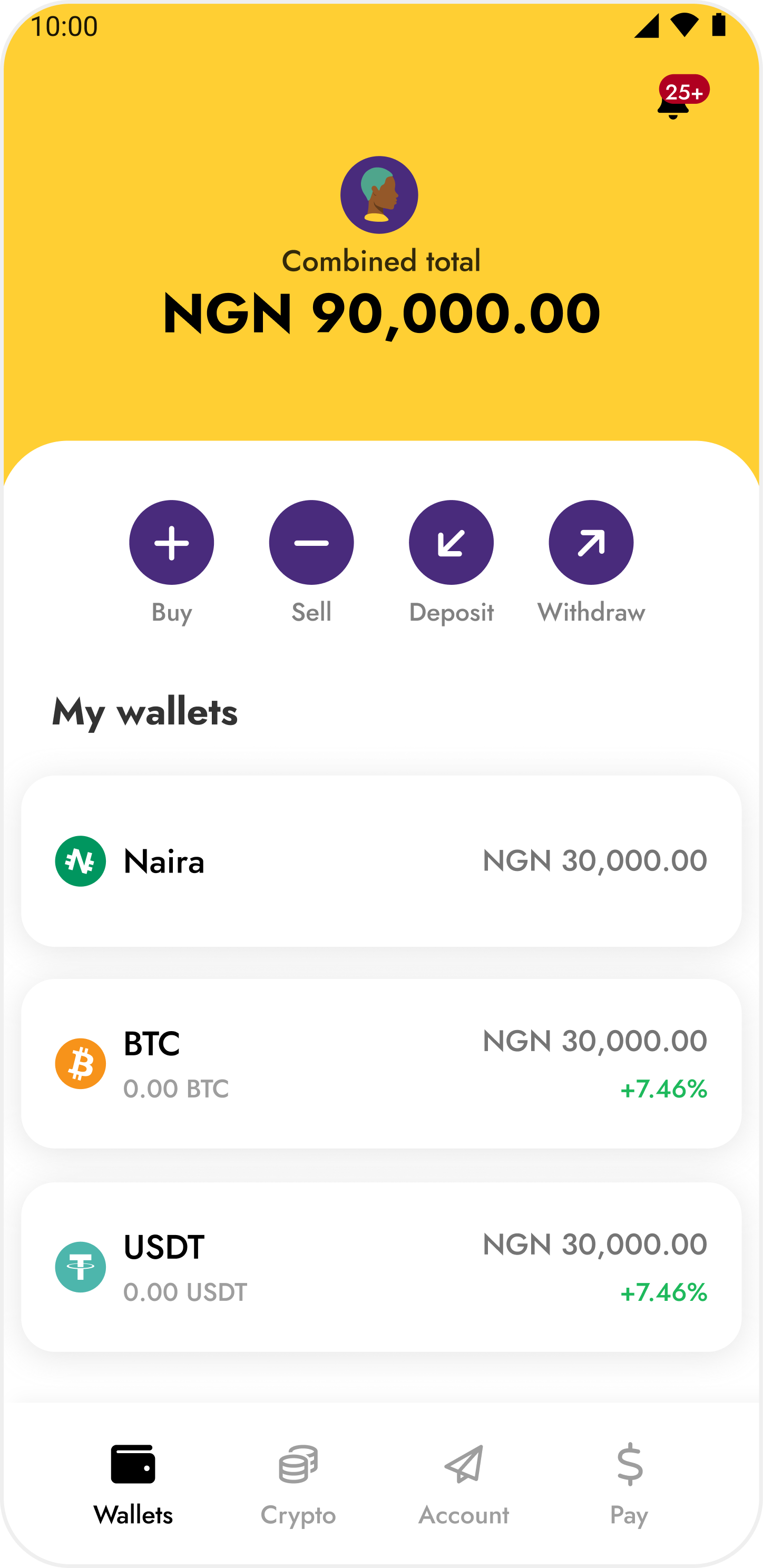
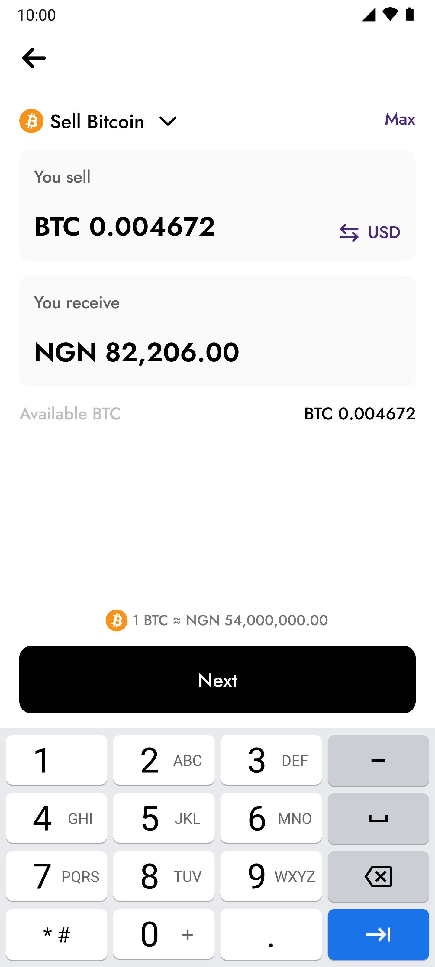
Some parts of the flow lacked transparency and clarity, making it difficult for customers to know how to navigate around the flow hence contributing to more drop-offs. This ambiguity also led to an increase in customers reaching out to our Customer Service team which we were working towards eliminating. A good example of this problem will be on the screen where customers need to enter an amount to trade.
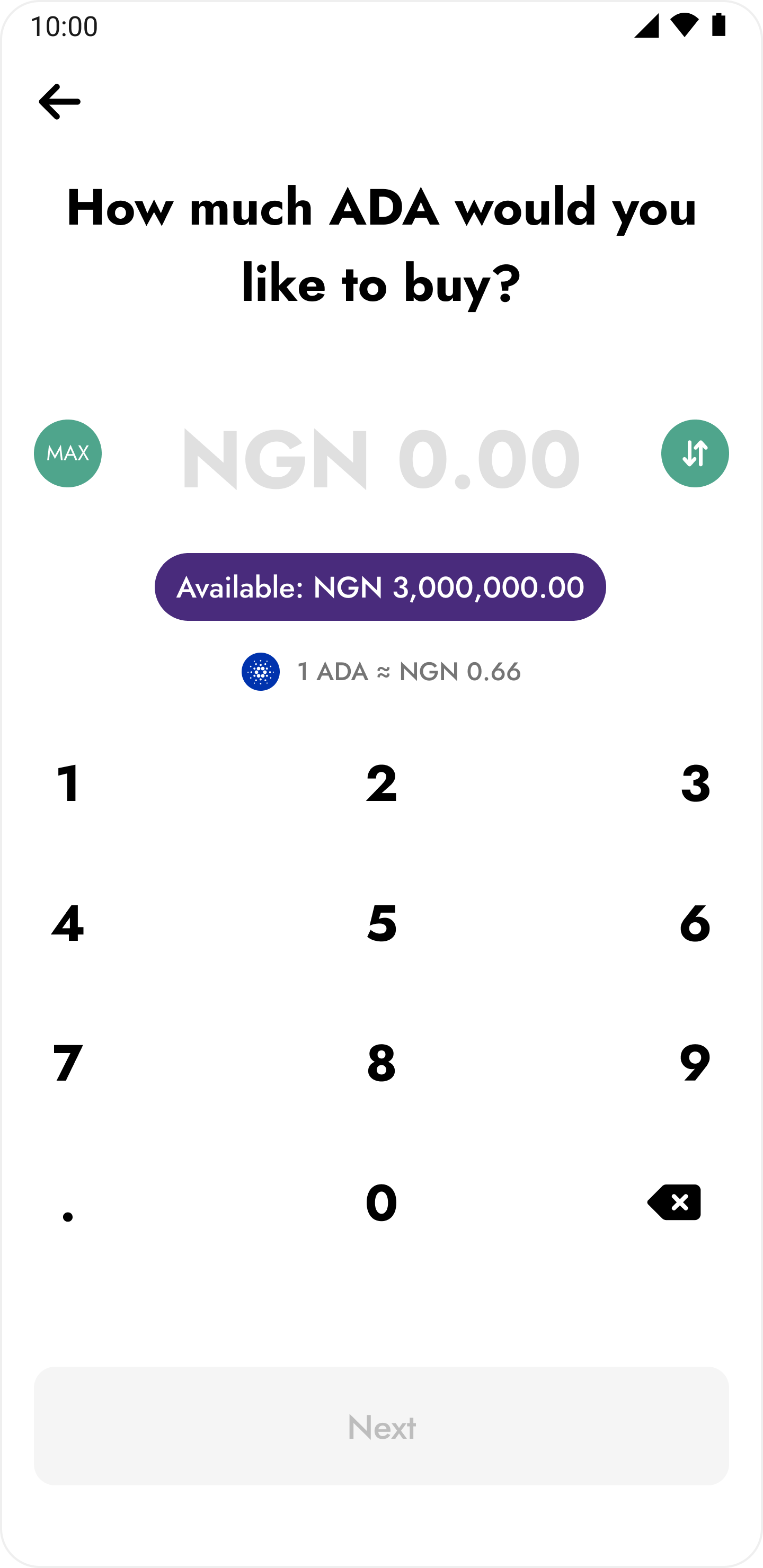
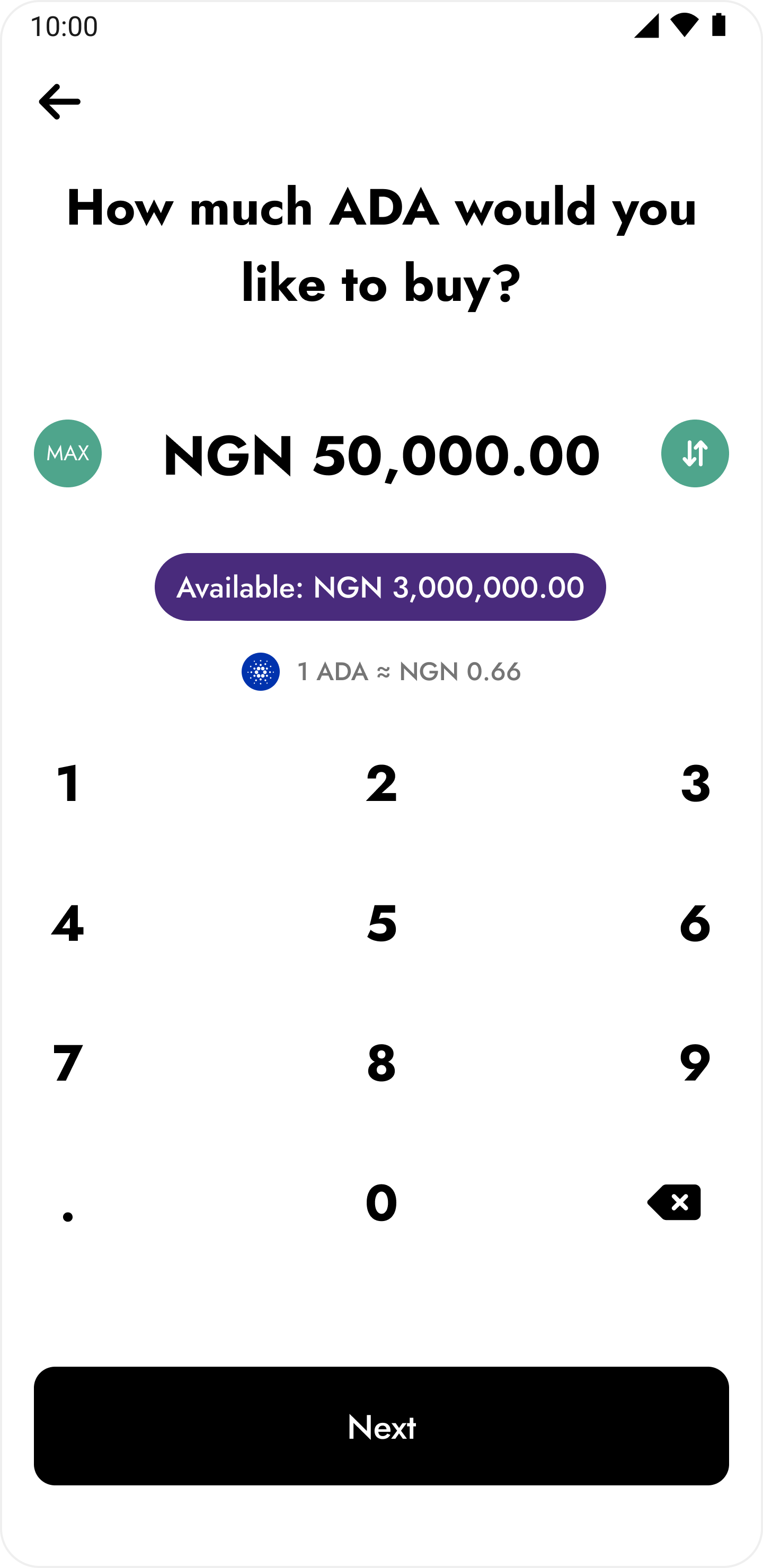
Trade amount input screens
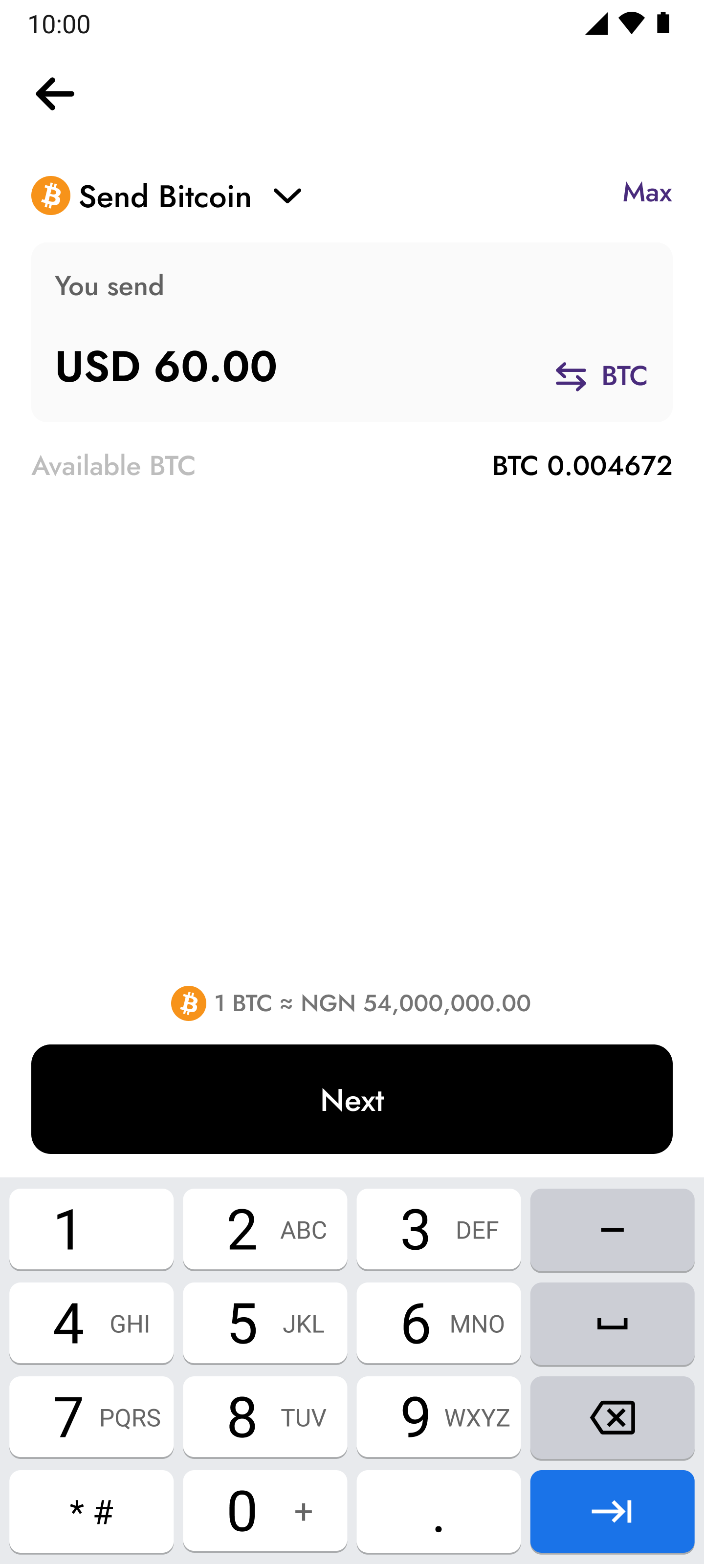
It turned out that some customers weren’t used to this pattern of input and controls. On entering an amount in their local currency, some customers needed to toggle this amount to a USD equivalent but were unable to realize that the toggle would be best for this as the toggle didn’t have enough affordance. The on-screen keyboard input also proved to be complicated to some at the time.
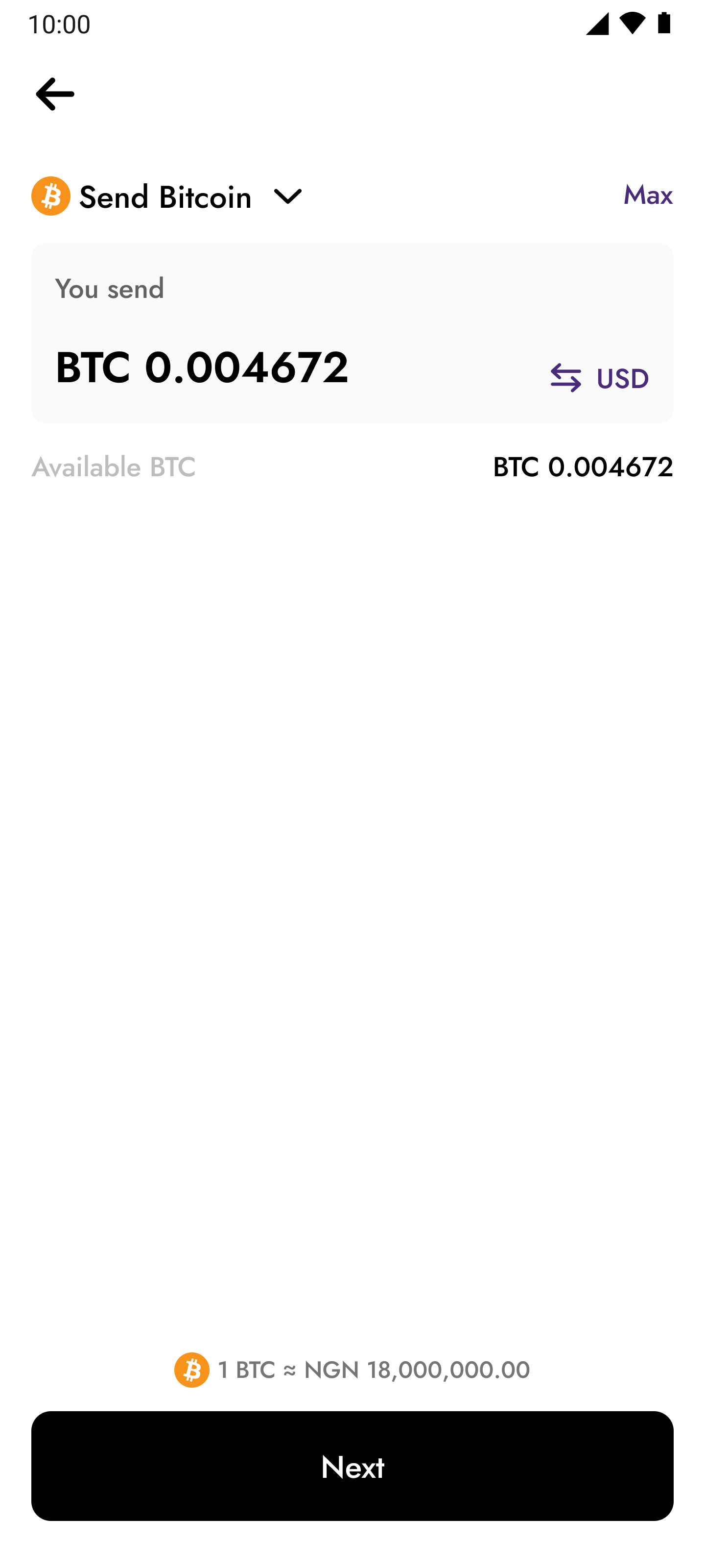
Fragmented user journey
Another major challenge we identified was the unnecessary screens in the flow. Instead of the extra screens to guide customers, the journey was constantly interrupted. On the send flow, we had a couple of redundant checks and screens that didn’t need to be in the flow. An example was the message received when trying to send to an external wallet address. While this was very obvious to some, it looked like an error to others.
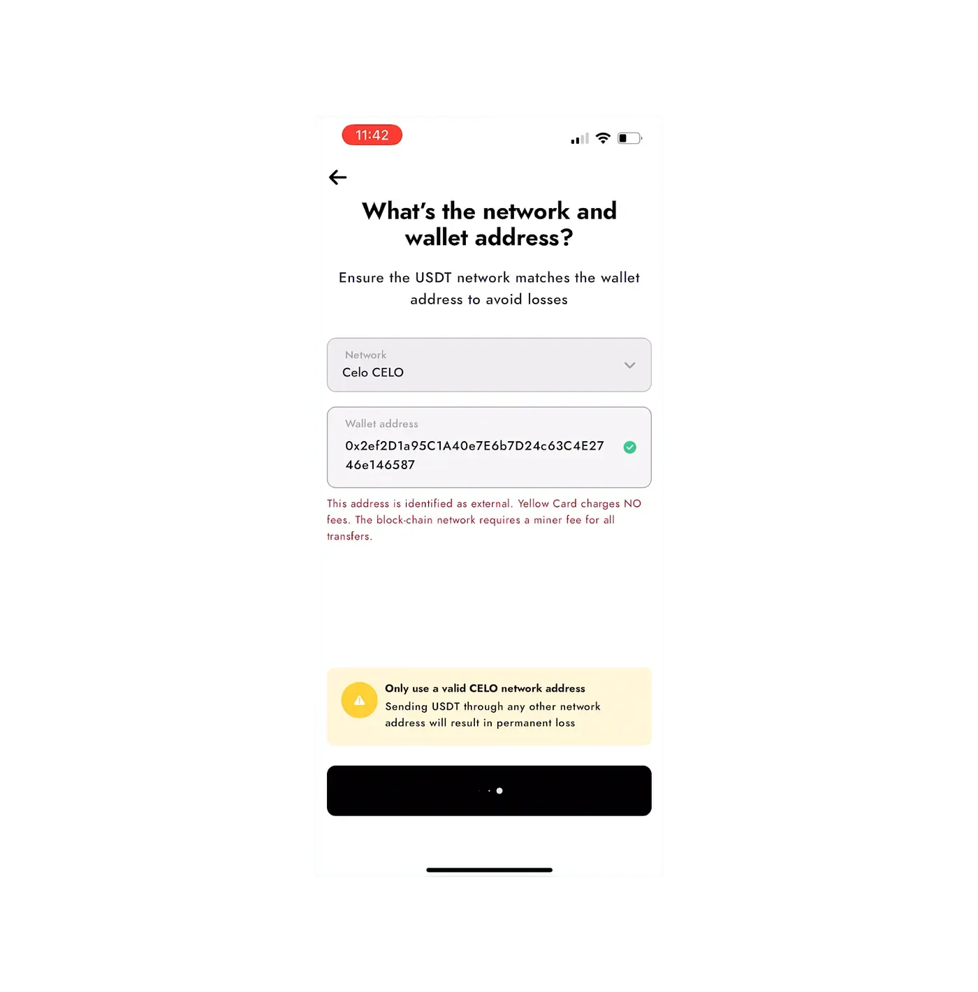
External wallet address validation
The solution upfront
I approached this problem holistically across the mobile app, with clear success metrics tied to conversion, retention, and transaction revenue growth. Given that the majority of our users were on mobile, I prioritised a mobile-first strategy to maximise impact quickly.


Solutions upfront
How i arrived at the solution
Solving this problem required a multi-step approach that involved thorough research, effective collaboration between stakeholders, and an iterative process. Each step was important in ensuring the changes addressed the immediate needs and also resulted in sustainable improvements.
Research and Discovery
Due to limited time to do a thorough research, i worked with the UX researcher and tried dogfooding first. We engaged with stakeholders across UX, Engineering, and Product to clearly understand their pain points on the current trade flow. Doing this helped to foster cross-collaboration and to have different perspectives on the problem.
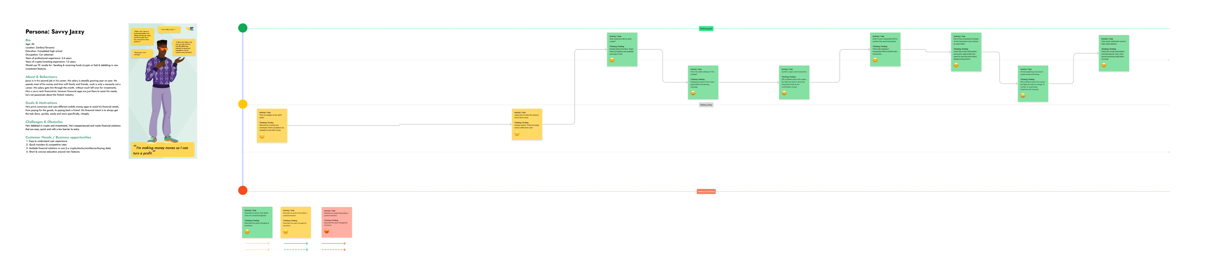
Emotional journey map for send flow
On analysing the feedback from stakeholders, We were able to buy some extra time for an extra research round, we sampled some testers who fall under a certain persona and worked on an emotional journey map to understand clearly how customers feel while going through the flow.
The sentiment was mostly positive, thankfully. It was also interesting to see the pain points being validated which gave us an extra reason to prioritise these problems and improve the overall experience for the customer.
Redesigning the Flow
After gathering insights, . I split the focus between the 3 major flows we had in the platform. The Buy flows, Sell flows, and Send flows. One major action taken was consolidating multiple screens that performed similar functions or required repetitive inputs. I found out that doing this helped with reducing the number of clicks and steps, making the process more seamless.
In addition to that, i made sure to optimize the interactions for low end devices as well. Basically designing with the motive to reduce as much errors as possible


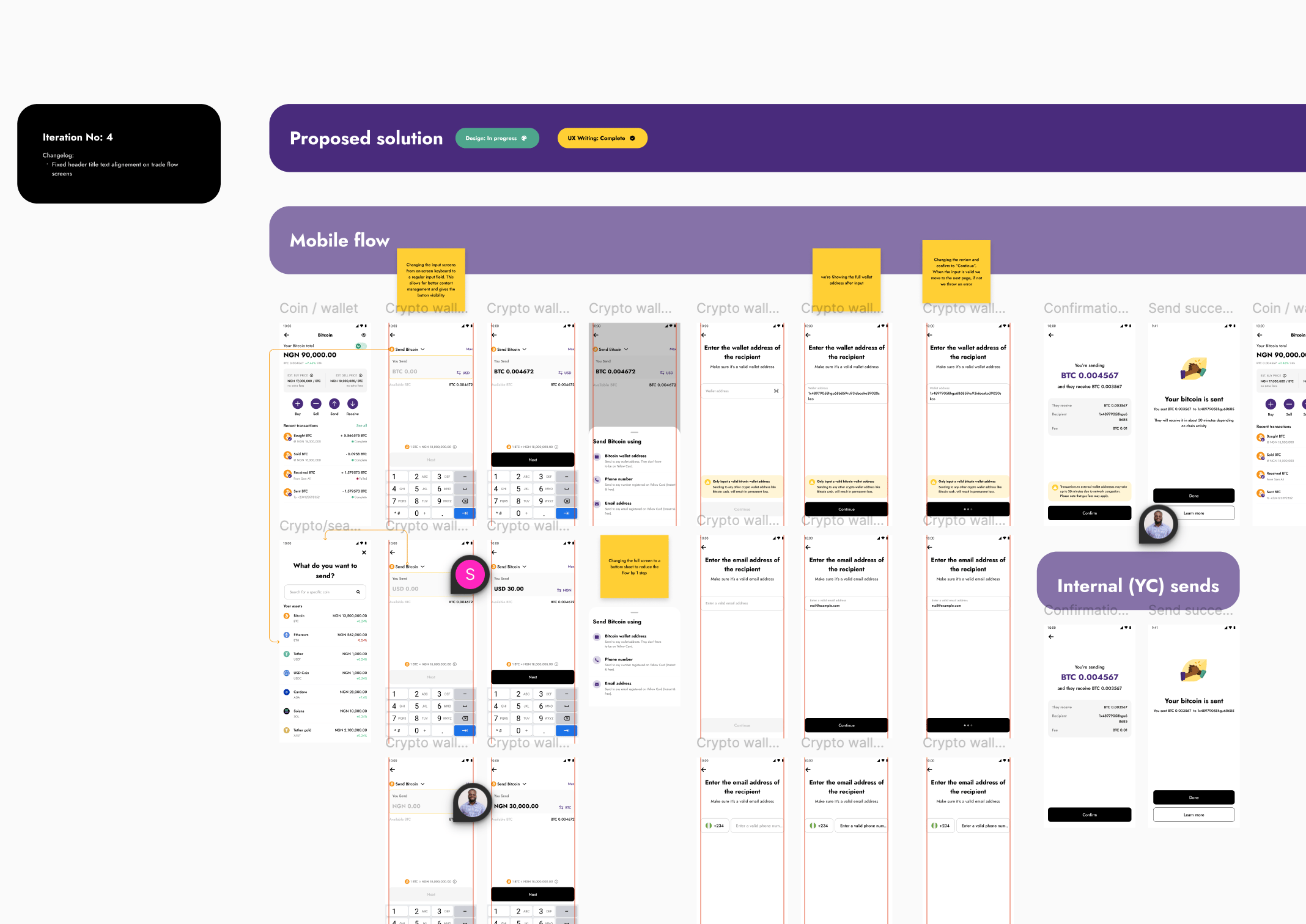
Snapshot of the iteration process
Prototyping and concepts validation
Since more stakeholders were involved in this already, i had to bring my redesigns to them to validate. It was a major change and i also needed to get as much validation as possible especially from the mobile engineers, to also manage expectations when building.
I also showed this to some members of the customer support team informing them that we would need some help articles and support content to take customers through what has changed and hopefully help reduce the learning curve while using this
Measuring impact
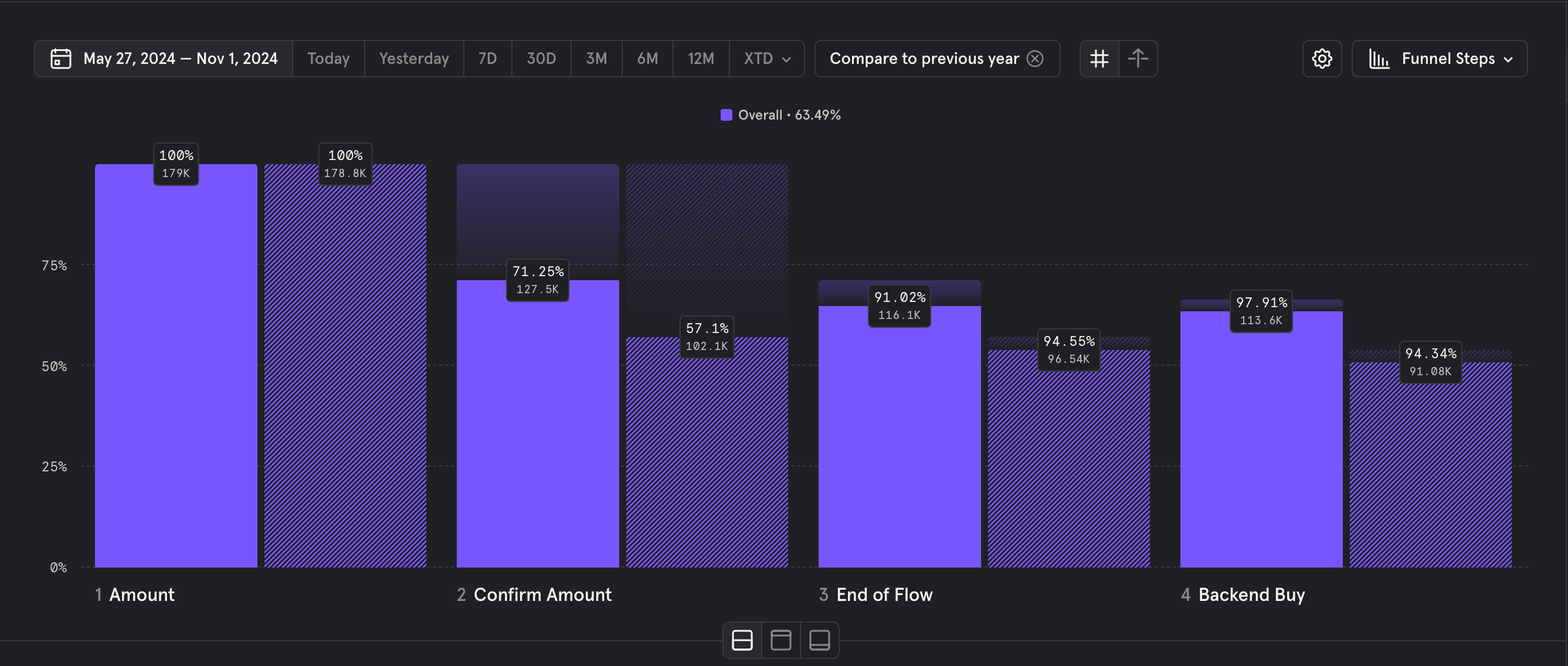
On our team, we use Mixpanel to track and analyze user behaviour on our mobile platform. Looking at the buy flow on Mobile, It was interesting to see that we have made about 63.49% improvements to conversion overall. As much as it is important for improvements to be clearly seen, it is also important to be sure that the new changes didn’t disrupt the already existing mental model for our customers
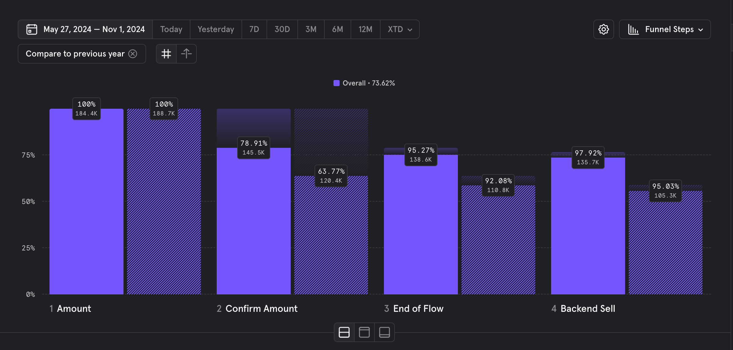
The sell flow made about 73.69% conversion improvements overrall comparing over same date range.
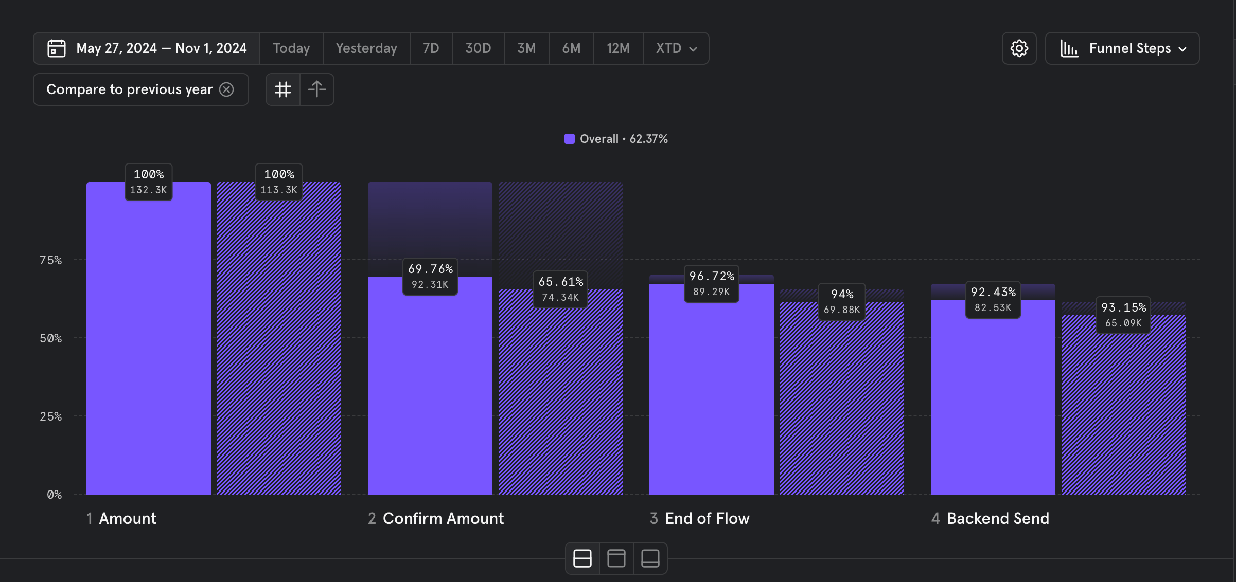
The send flow made about 62.3% conversion improvements overall comparing over the same date range
Key learnings
The biggest challenge on this project was making sure customers had a smooth transition from the old to the new. Some people don’t do well with change, so it was important to prioritize education and familiarity as much as we had to prioritize innovation.
Something that worked well was the stakeholder collaboration. Working closely with the engineering team on this project clearly helped shape it into what it is today and I do not take it for granted, ever.
Looking ahead, I’ll be monitoring these changes in production to make sure they continue to meet the purpose of the redesign.


Back to home
Next project
Contact me
Let’s talk about how i can bring your product idea to life. Dudumukwu@gmail.com :)
Driving 60%+ conversion growth across Buy, Sell and Send Flows
Cryptocurrency trading was the primary revenue driver across our active African markets, and we identified a significant drop-off beginning at the amount entry stage of the trade flow. This signalled a critical conversion gap, prompting deeper investigation into user behaviour, friction points, and the underlying causes impacting completion rates.
ROLE
Lead Product Designer
TEAM MEMBERS
Ryan Jales
Head UX research and writing
TOOL STACK


The problem(s)
High dropoff rates across trade flows
On analysing the drop off rates on Mixpanel, we were on a high rate of 35.23% for the sell flow and 38.92% on the buy flow. These numbers were discovered on the “enter amount” screen and really needed to be fixed or at least investigated.
Drop off rates - Buy flow
Redundant steps
Looking across the trade flows, it had so many redundant screens. Screens that we earlier thought would help with the overall experience but rather made things harder to interact with and even understand
“What do you want to buy” bottom sheet
Lack of clarity
Some parts of the flow lacked transparency and clarity, making it difficult for customers to know how to navigate around the flow hence contributing to more drop-offs. This ambiguity also led to an increase in customers reaching out to our Customer Service team which we were working towards eliminating. A good example of this problem will be on the screen where customers need to enter an amount to trade.
Trade amount input screens
It turned out that some customers weren’t used to this pattern of input and controls. On entering an amount in their local currency, some customers needed to toggle this amount to a USD equivalent but were unable to realize that the toggle would be best for this as the toggle didn’t have enough affordance. The on-screen keyboard input also proved to be complicated to some at the time.
Fragmented user journey
Another major challenge we identified was the unnecessary screens in the flow. Instead of the extra screens to guide customers, the journey was constantly interrupted. On the send flow, we had a couple of redundant checks and screens that didn’t need to be in the flow. An example was the message received when trying to send to an external wallet address. While this was very obvious to some, it looked like an error to others.
External wallet address validation
The solution upfront
I approached this problem holistically across the mobile app, with clear success metrics tied to conversion, retention, and transaction revenue growth. Given that the majority of our users were on mobile, I prioritised a mobile-first strategy to maximise impact quickly.


Solutions upfront
How i arrived at the solution
Solving this problem required a multi-step approach that involved thorough research, effective collaboration between stakeholders, and an iterative process. Each step was important in ensuring the changes addressed the immediate needs and also resulted in sustainable improvements.
Research and Discovery
Due to limited time to do a thorough research, i worked with the UX researcher and tried dogfooding first. We engaged with stakeholders across UX, Engineering, and Product to clearly understand their pain points on the current trade flow. Doing this helped to foster cross-collaboration and to have different perspectives on the problem.
Emotional journey map for send flow
On analysing the feedback from stakeholders, We were able to buy some extra time for an extra research round, we sampled some testers who fall under a certain persona and worked on an emotional journey map to understand clearly how customers feel while going through the flow.
The sentiment was mostly positive, thankfully. It was also interesting to see the pain points being validated which gave us an extra reason to prioritise these problems and improve the overall experience for the customer.
Redesigning the Flow
After gathering insights, . I split the focus between the 3 major flows we had in the platform. The Buy flows, Sell flows, and Send flows. One major action taken was consolidating multiple screens that performed similar functions or required repetitive inputs. I found out that doing this helped with reducing the number of clicks and steps, making the process more seamless.
In addition to that, i made sure to optimize the interactions for low end devices as well. Basically designing with the motive to reduce as much errors as possible
Snapshot of the iteration process
Prototyping and concepts validation
Since more stakeholders were involved in this already, i had to bring my redesigns to them to validate. It was a major change and i also needed to get as much validation as possible especially from the mobile engineers, to also manage expectations when building.
I also showed this to some members of the customer support team informing them that we would need some help articles and support content to take customers through what has changed and hopefully help reduce the learning curve while using this
Measuring impact
On our team, we use Mixpanel to track and analyze user behaviour on our mobile platform. Looking at the buy flow on Mobile, It was interesting to see that we have made about 63.49% improvements to conversion overall. As much as it is important for improvements to be clearly seen, it is also important to be sure that the new changes didn’t disrupt the already existing mental model for our customers
The sell flow made about 73.69% conversion improvements overrall comparing over same date range.
The send flow made about 62.3% conversion improvements overall comparing over the same date range
Key learnings
The biggest challenge on this project was making sure customers had a smooth transition from the old to the new. Some people don’t do well with change, so it was important to prioritize education and familiarity as much as we had to prioritize innovation.
Something that worked well was the stakeholder collaboration. Working closely with the engineering team on this project clearly helped shape it into what it is today and I do not take it for granted, ever.
Looking ahead, I’ll be monitoring these changes in production to make sure they continue to meet the purpose of the redesign.
Contact me
Let’s talk about how i can bring your product idea to life. Dudumukwu@gmail.com :)
Driving 60%+ conversion growth across Buy, Sell and Send Flows
Cryptocurrency trading was the primary revenue driver across our active African markets, and we identified a significant drop-off beginning at the amount entry stage of the trade flow. This signalled a critical conversion gap, prompting deeper investigation into user behaviour, friction points, and the underlying causes impacting completion rates.
ROLE
Lead Product Designer
TEAM MEMBERS
Ryan Jales
Head UX research and writing
TOOL STACK
The problem(s)
High dropoff rates across trade flows
On analysing the drop off rates on Mixpanel, we were on a high rate of 35.23% for the sell flow and 38.92% on the buy flow. These numbers were discovered on the “enter amount” screen and really needed to be fixed or at least investigated.
Drop off rates - Buy flow
Redundant steps
Looking across the trade flows, it had so many redundant screens. Screens that we earlier thought would help with the overall experience but rather made things harder to interact with and even understand
“What do you want to buy” bottom sheet
Lack of clarity
Some parts of the flow lacked transparency and clarity, making it difficult for customers to know how to navigate around the flow hence contributing to more drop-offs. This ambiguity also led to an increase in customers reaching out to our Customer Service team which we were working towards eliminating. A good example of this problem will be on the screen where customers need to enter an amount to trade.
Trade amount input screens
It turned out that some customers weren’t used to this pattern of input and controls. On entering an amount in their local currency, some customers needed to toggle this amount to a USD equivalent but were unable to realize that the toggle would be best for this as the toggle didn’t have enough affordance. The on-screen keyboard input also proved to be complicated to some at the time.
Fragmented user journey
Another major challenge we identified was the unnecessary screens in the flow. Instead of the extra screens to guide customers, the journey was constantly interrupted. On the send flow, we had a couple of redundant checks and screens that didn’t need to be in the flow. An example was the message received when trying to send to an external wallet address. While this was very obvious to some, it looked like an error to others.
External wallet address validation
The solution upfront
I approached this problem holistically across the mobile app, with clear success metrics tied to conversion, retention, and transaction revenue growth. Given that the majority of our users were on mobile, I prioritised a mobile-first strategy to maximise impact quickly.
Solutions upfront
How i arrived at the solution
Solving this problem required a multi-step approach that involved thorough research, effective collaboration between stakeholders, and an iterative process. Each step was important in ensuring the changes addressed the immediate needs and also resulted in sustainable improvements.
Research and Discovery
Due to limited time to do a thorough research, i worked with the UX researcher and tried dogfooding first. We engaged with stakeholders across UX, Engineering, and Product to clearly understand their pain points on the current trade flow. Doing this helped to foster cross-collaboration and to have different perspectives on the problem.
Emotional journey map for send flow
On analysing the feedback from stakeholders, We were able to buy some extra time for an extra research round, we sampled some testers who fall under a certain persona and worked on an emotional journey map to understand clearly how customers feel while going through the flow.
The sentiment was mostly positive, thankfully. It was also interesting to see the pain points being validated which gave us an extra reason to prioritise these problems and improve the overall experience for the customer.
Redesigning the Flow
After gathering insights, . I split the focus between the 3 major flows we had in the platform. The Buy flows, Sell flows, and Send flows. One major action taken was consolidating multiple screens that performed similar functions or required repetitive inputs. I found out that doing this helped with reducing the number of clicks and steps, making the process more seamless.
In addition to that, i made sure to optimize the interactions for low end devices as well. Basically designing with the motive to reduce as much errors as possible
Snapshot of the iteration process
Prototyping and concepts validation
Since more stakeholders were involved in this already, i had to bring my redesigns to them to validate. It was a major change and i also needed to get as much validation as possible especially from the mobile engineers, to also manage expectations when building.
I also showed this to some members of the customer support team informing them that we would need some help articles and support content to take customers through what has changed and hopefully help reduce the learning curve while using this
Measuring impact
On our team, we use Mixpanel to track and analyze user behaviour on our mobile platform. Looking at the buy flow on Mobile, It was interesting to see that we have made about 63.49% improvements to conversion overall. As much as it is important for improvements to be clearly seen, it is also important to be sure that the new changes didn’t disrupt the already existing mental model for our customers
The sell flow made about 73.69% conversion improvements overrall comparing over same date range.
The send flow made about 62.3% conversion improvements overall comparing over the same date range
Key learnings
The biggest challenge on this project was making sure customers had a smooth transition from the old to the new. Some people don’t do well with change, so it was important to prioritize education and familiarity as much as we had to prioritize innovation.
Something that worked well was the stakeholder collaboration. Working closely with the engineering team on this project clearly helped shape it into what it is today and I do not take it for granted, ever.
Looking ahead, I’ll be monitoring these changes in production to make sure they continue to meet the purpose of the redesign.

Contact me
Let’s talk about how i can bring your product idea to life. Dudumukwu@gmail.com :)