

Unlocking Cross-border growth: Increasing conversion by 19% for Yellow Pay
Following the launch of Yellow Pay, early user adoption and engagement were strong among our existing customer base. However, regulatory constraints limited traditional acquisition channels, so the focus shifted toward driving product-led growth through increased adoption, retention, and network effects.
The strategy centred on enabling existing users to discover value quickly, build habitual usage, and organically expand the user base through peer invitations and referrals.
ROLE
Lead Product Designer
TEAM MEMBERS
Ryan Jales
Head UX research and writing
Timileyin Soyemi
Product Manager
TOOL STACK


The problem
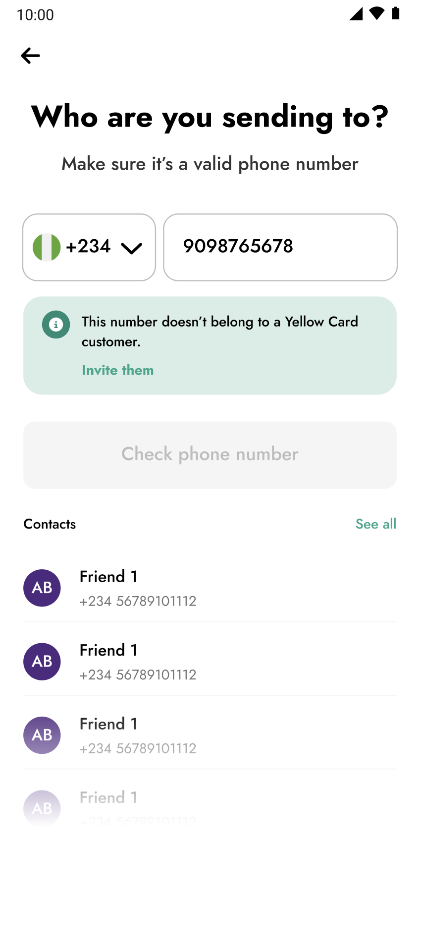
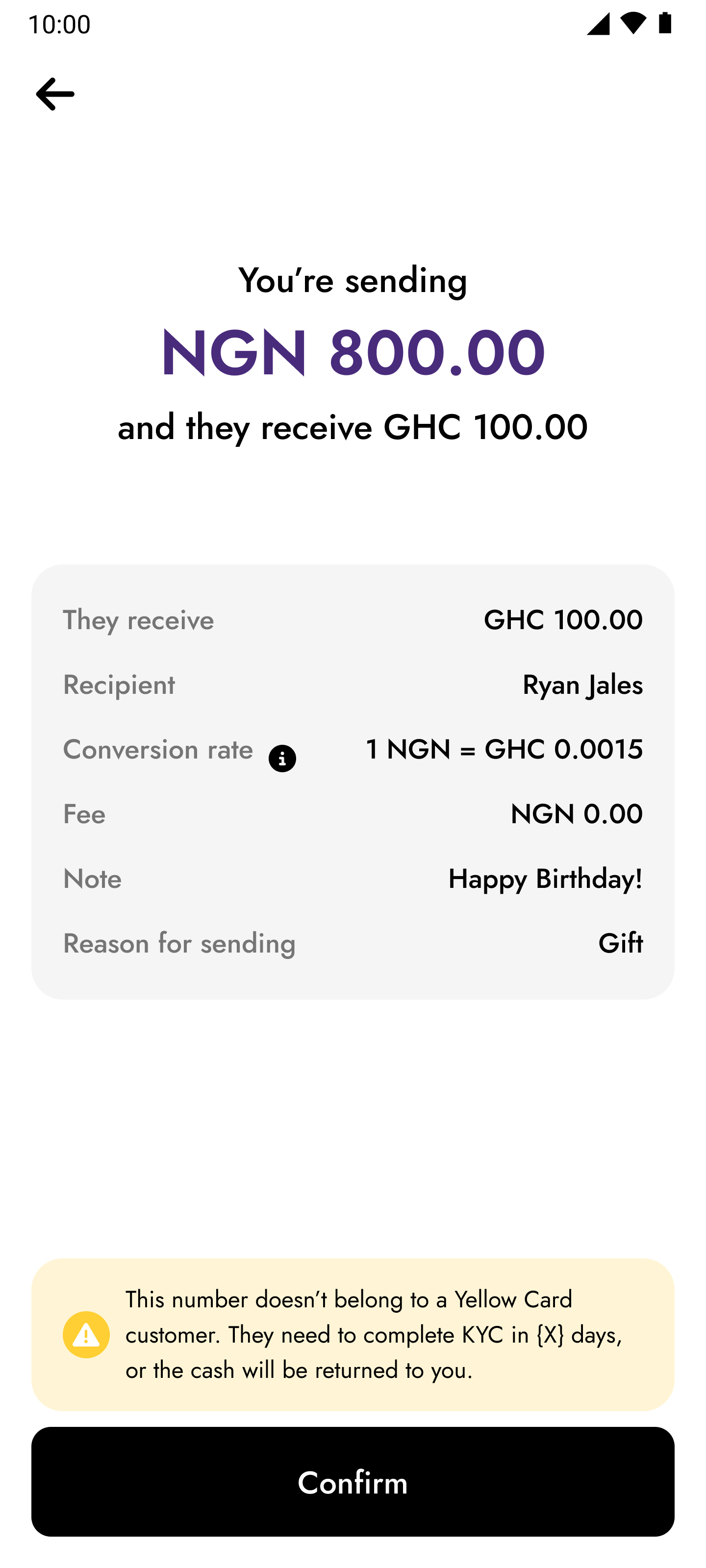
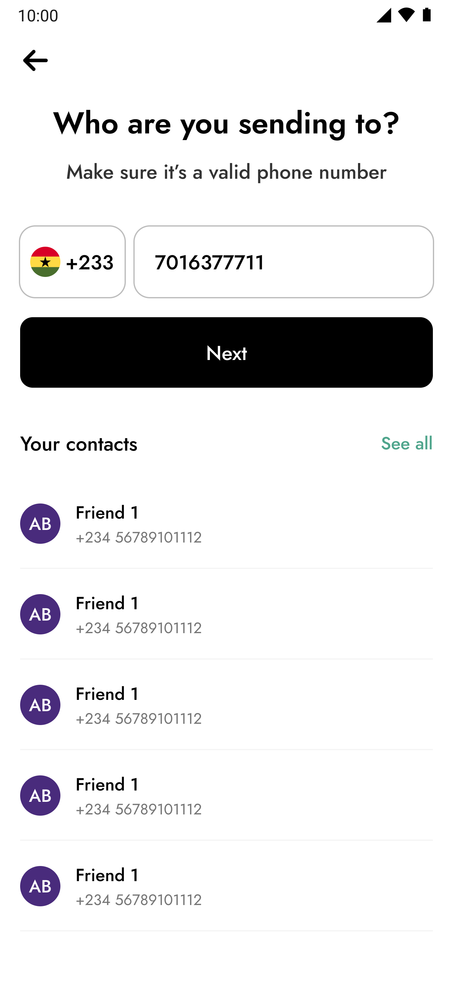
We noticed that a lot of our customers were dropping off at the point where they were asked to input the phone number of the recipient. The recipients weren’t on Yellow Card, and the message we showed them made it look like they couldn’t proceed with their send transaction

Check phone number
Contacts


+234

9098765678
10:00


Who are you sending to?
Make sure it’s a valid phone number
Contacts

AB
Friend 1
+234 56789101112
AB
Friend 1
+234 56789101112
AB
Friend 1
+234 56789101112
AB
Friend 1
+234 56789101112
AB
Friend 1
+234 56789101112
See all


This number doesn’t belong to a Yellow Card customer.
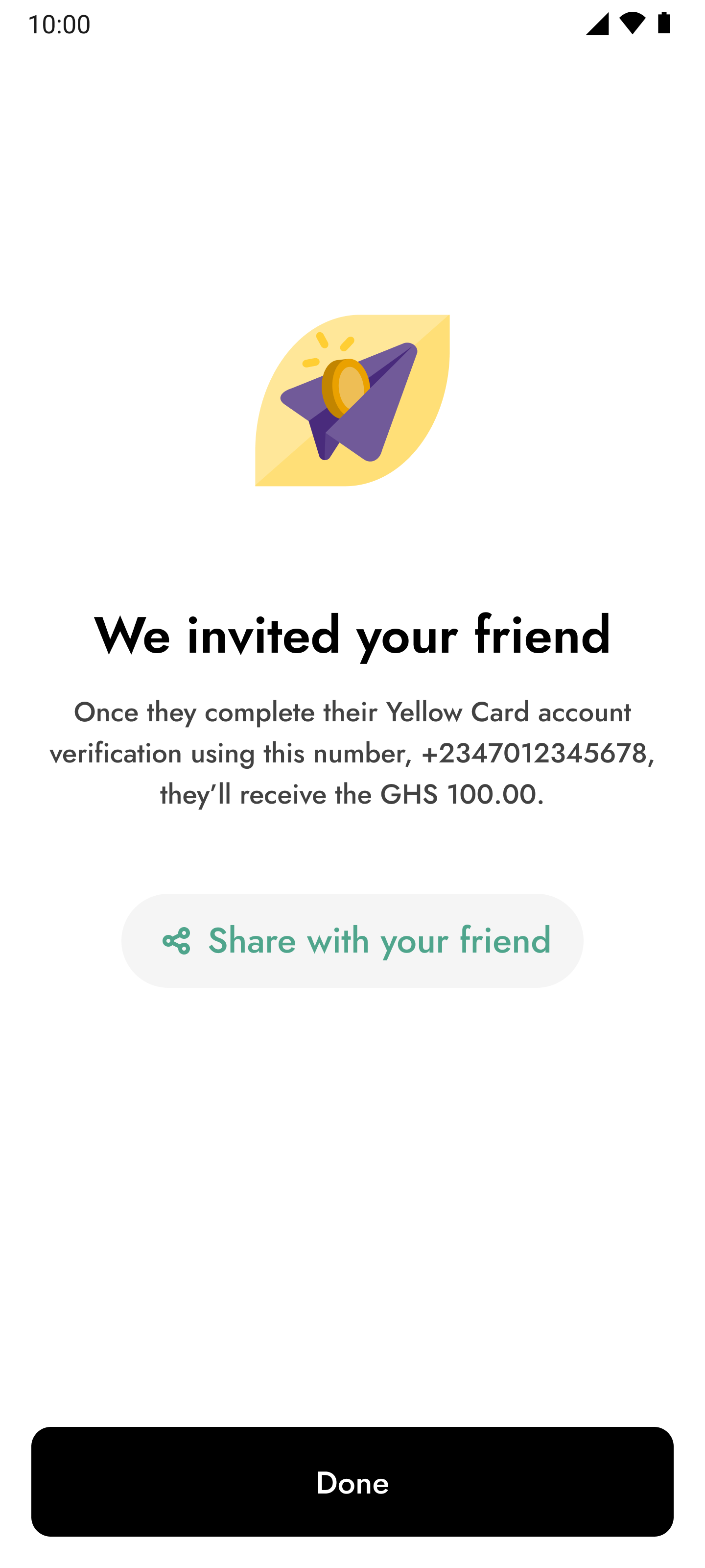
Invite them
On this screen you see the message pop up introduced
The solution upfront
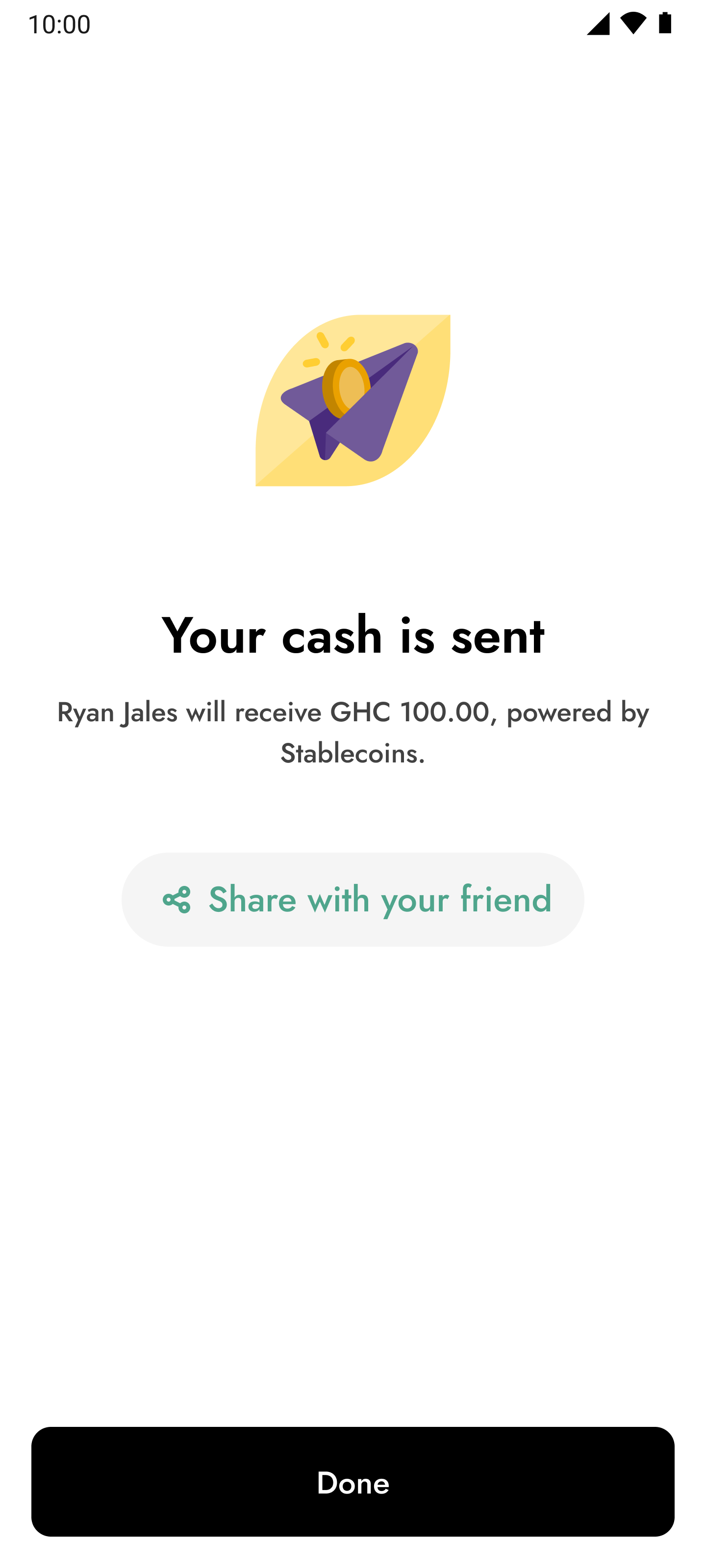
We made it possible for customers to send money to their friends that weren’t on the app, by putting the money in a ledger balance, afterwards they get credited when they signed up.
At the design stage, I solved this problem by improving visibility of the feature on the app, and creating a mental model that helped them understand that they can continue sending money but the recipient will only get it after they create an account
Solutions upfront
How i arrived at the solution
Survey responses and early usage data confirmed the problem. Users wanted to use Yellow Pay, but a significant number abandoned their send attempts after noticing the recipient wasn’t already on the platform. Instead of letting that interest die at the point of friction, we decided to build a solution that would keep the transaction pipeline alive.
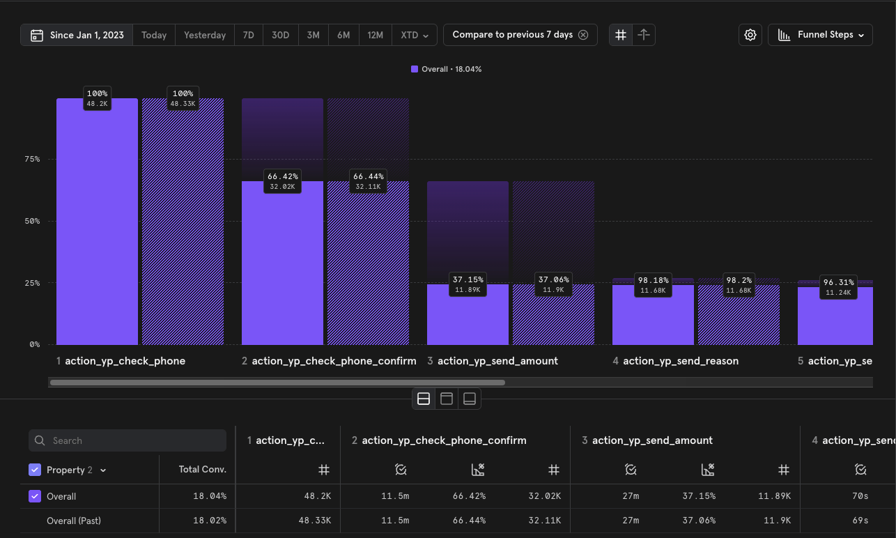
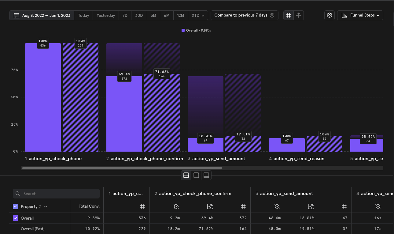
Mixpanel events from Aug 8, 2022 - Jan1,2023
Google form survey results
Six things that helped redefine the whole experience
Bringing a Yellow Pay widget to the home page
In order to improve visibility of the feature, i added a widget to the home page. In entering the amount they wished to send from this point, they bypass major steps within the flow, which made the journey shorter to complete.


Send cash with Yellow Pay
I want to send


NGN
They will receive
NGN

NGN 1.00 ≈ NGN 1.00
Zero fees
0.00 NGN

Should arrive in
Seconds
Yellow Pay lets you send cash to over 20 countries in Africa, powered by Stablecoins. Learn More
Send cash
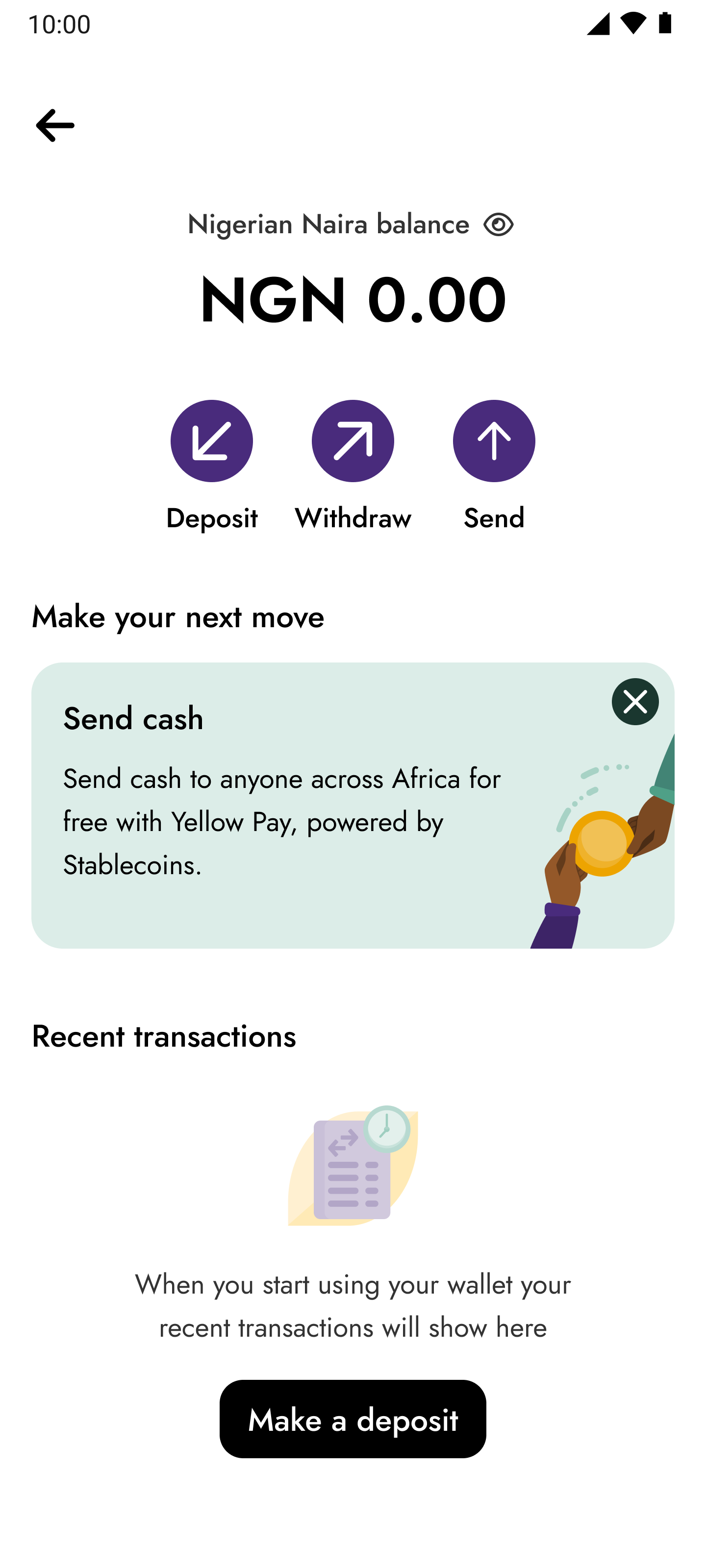
Removed friction from the flow
Using progressive disclosure, I took out the warning/info message about sending cash to a customer that isn’t on the app. To the end of the flow, that way they don’t think it’s impossible to send cash to someone not registered, but they just understand that the recipient can still get it they just have to create an account on Yellow Card.


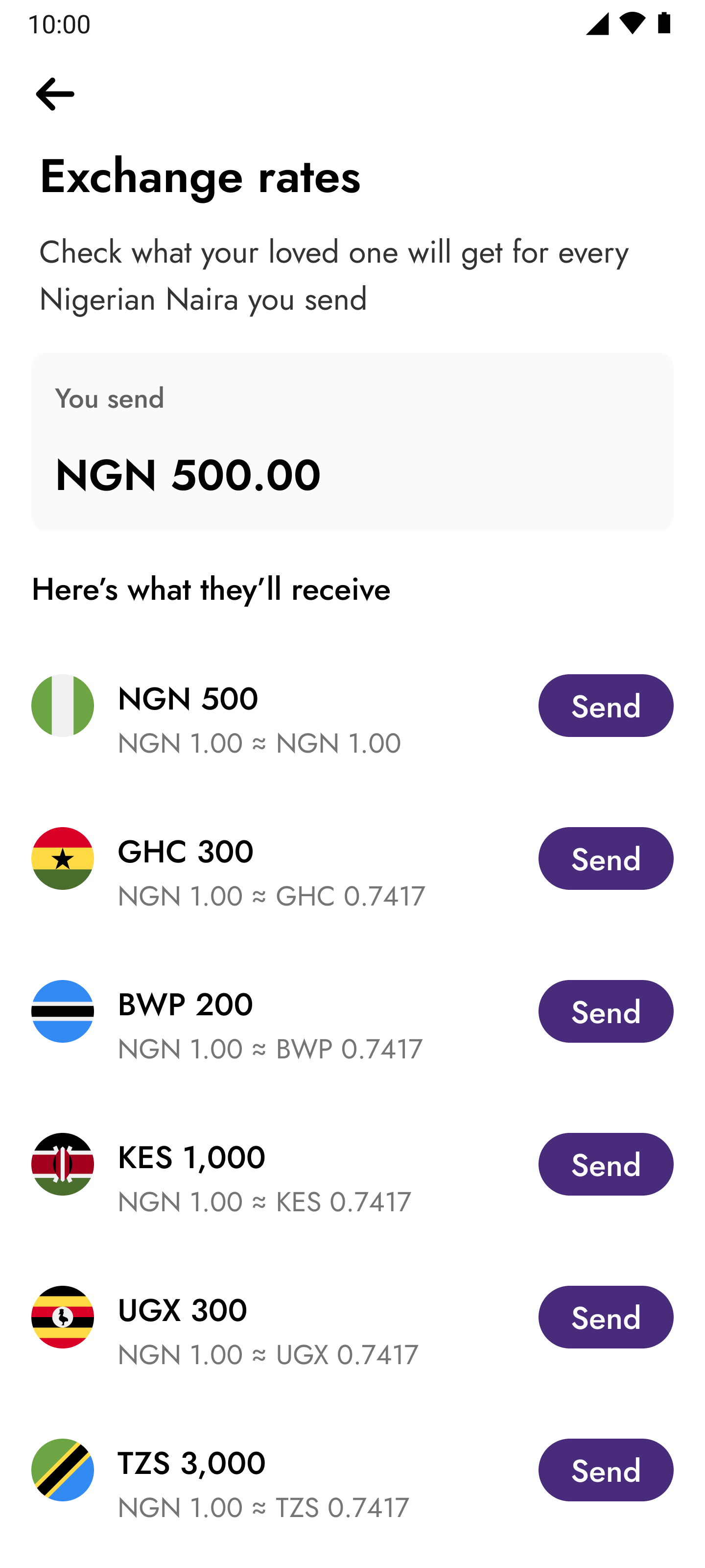
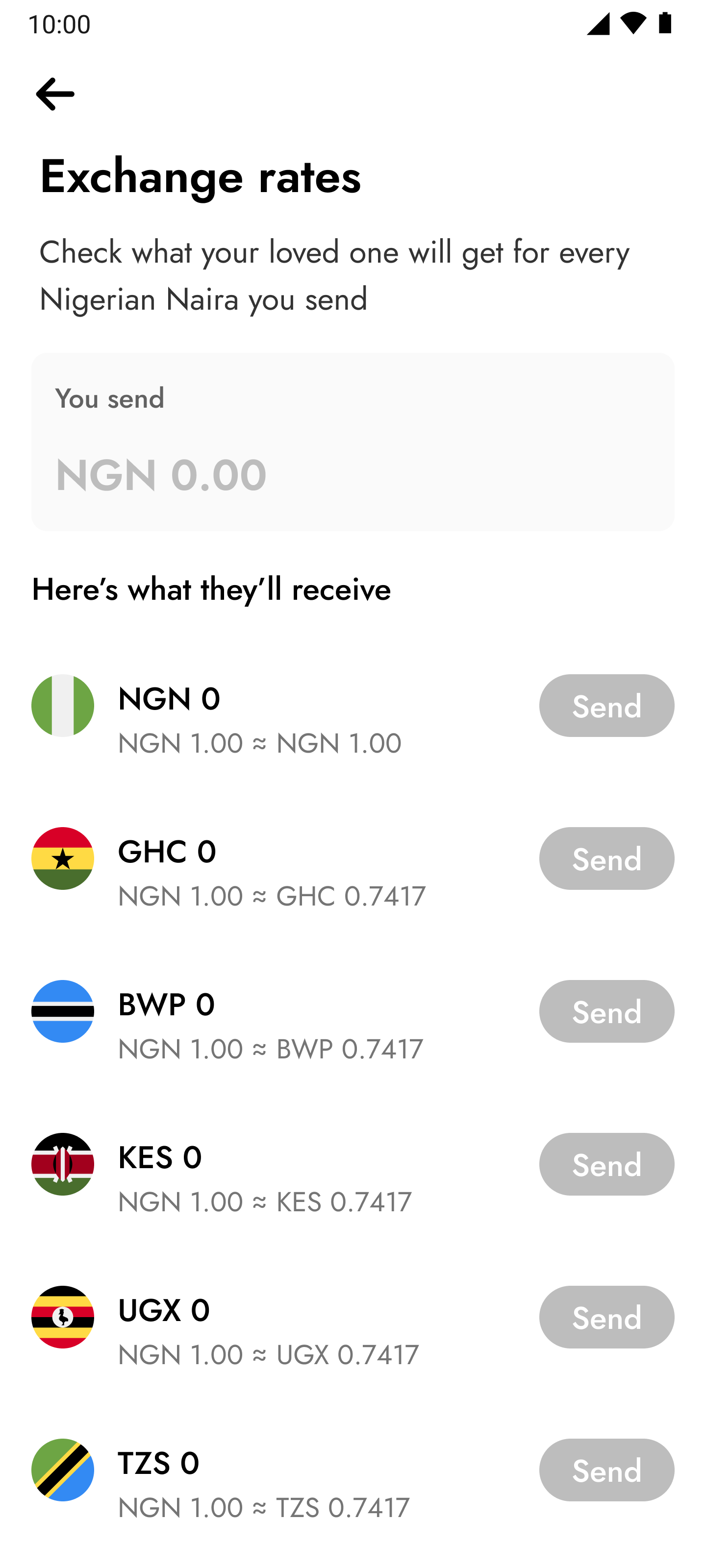
Introduced a rates calculator
Yellow Card helped it’s customers send cash across 20+ countries, at low fees powered by stable coins. I designed a rates calculator to help with insights on what amount would be received in the recipient’s currency when sending on Yellow Pay. Our rates were competitive, and sending to same countries were free


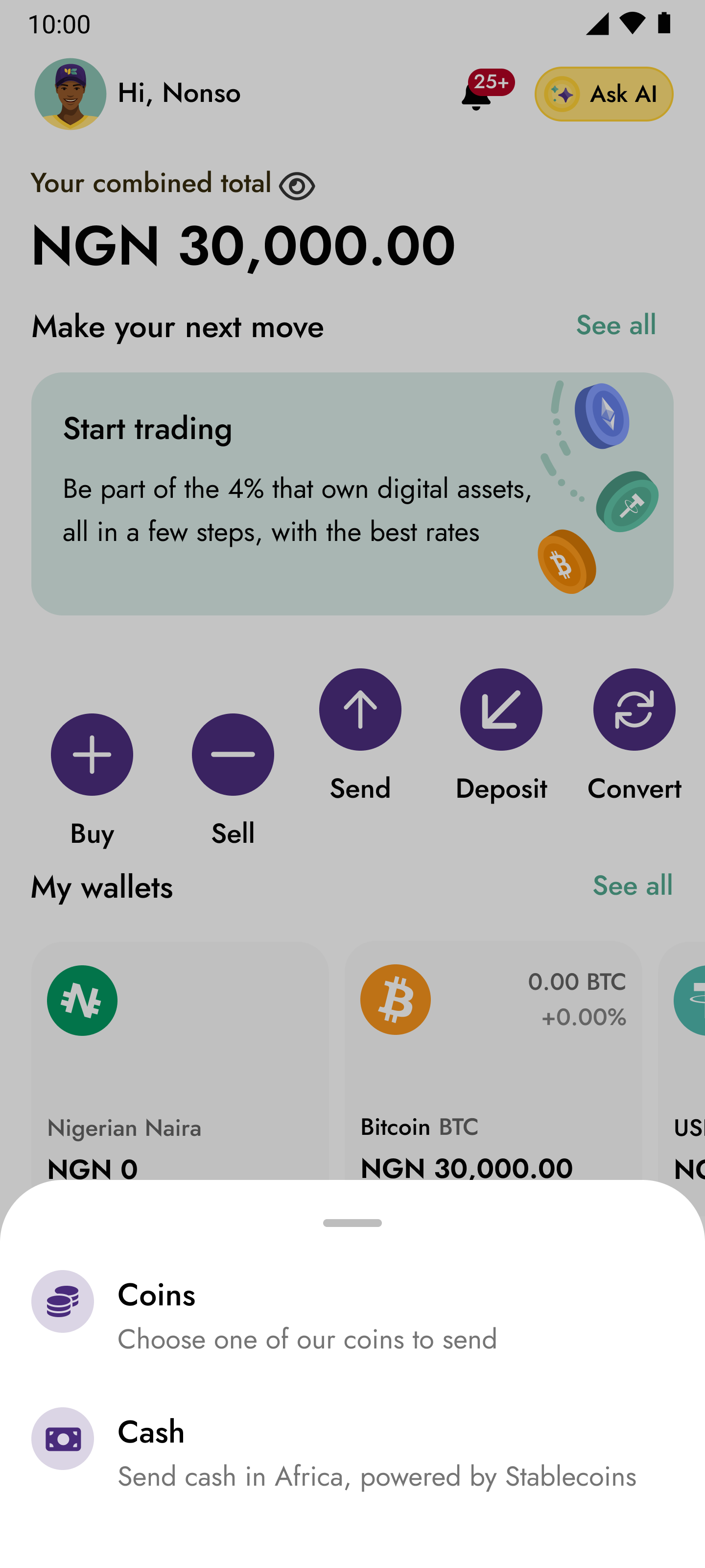
Redesigned the Yellow Pay home experience
I redesigned the Yellow Pay home experience to make it easier for users to understand how the feature works and also manage other activities easier. This happened by selling the value of the feature through articles and placing them upfront if you haven’t performed any transaction
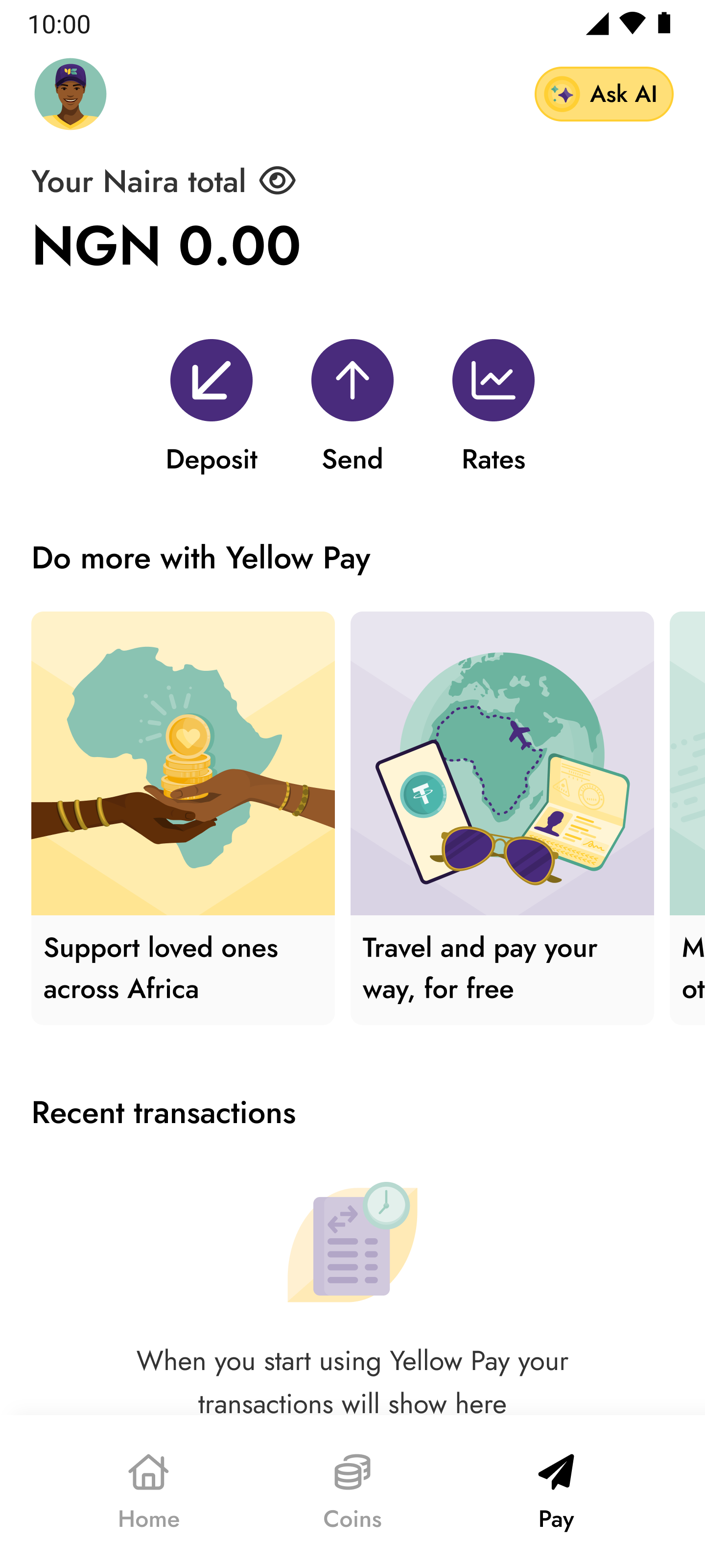
Introduced send cash function to more locations on the app
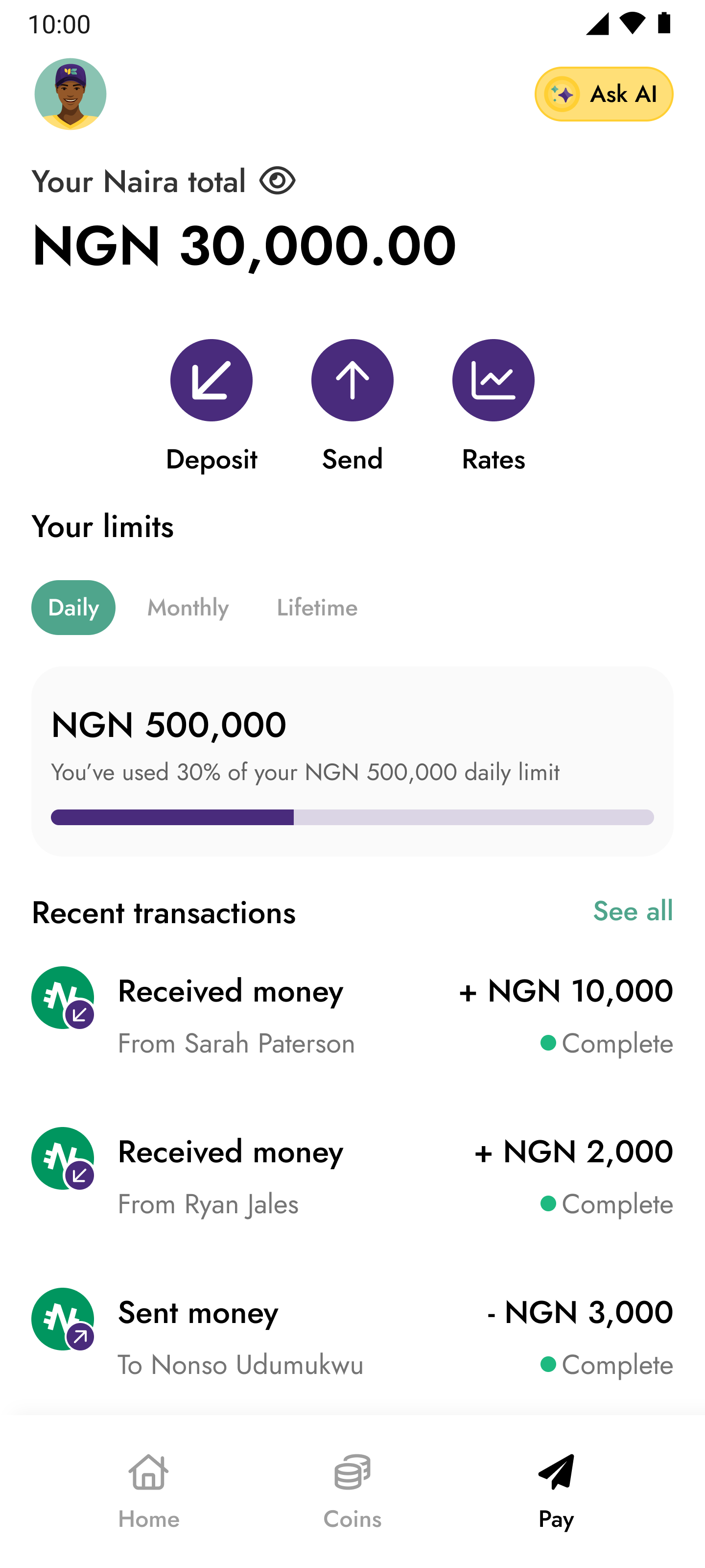
I added the send button to other places on the app, the home page and the local currency wallet. It was worth including that function in more areas on the app to help drive send volume and also usage
Improved referral messages and copy
I worked alongside our UX writer to improve the micro copy being used on the referral screen and text message. We did this so they can clearly understand what happens after sending to someone that isn’t registered on the app, and to also add an extra nudge for them.

Results and impact
These changes led to more successful transactions and increased adoption, as senders no longer hesitated to complete transfers. It reduced friction, and widened Yellow Pay’s reach organically.

Mixpanel events before the invite flow was launched

Mixpanel events after the invite flow was launched
Slight improvement here, more people were able to continue

Key learnings
This project reinforced several lessons for me as a designer:
Ship, then learn: The MVP approach helped us quickly identify the biggest blockers rather than over-investing upfront.
Design for growth loops: Features like the invite flow and Yellow Tags weren’t just usability fixes—they created viral adoption paths.
Balance compliance and usability: Regulatory needs don’t have to mean clunky experiences; they can be built into the flow naturally.
Visibility matters as much as usability: A feature hidden in a menu may as well not exist—surfacing core actions early is critical.

Back to home
Next project
Contact me
Let’s talk about how i can bring your product idea to life. Dudumukwu@gmail.com :)
Unlocking Cross-border growth: Increasing conversion by 19% for Yellow Pay
Following the launch of Yellow Pay, early user adoption and engagement were strong among our existing customer base. However, regulatory constraints limited traditional acquisition channels, so the focus shifted toward driving product-led growth through increased adoption, retention, and network effects.
The strategy centred on enabling existing users to discover value quickly, build habitual usage, and organically expand the user base through peer invitations and referrals.
ROLE
Lead Product Designer
TEAM MEMBERS
Ryan Jales
Head UX research and writing
Timileyin Soyemi
Product Manager
TOOL STACK

The problem
We noticed that a lot of our customers were dropping off at the point where they were asked to input the phone number of the recipient. The recipients weren’t on Yellow Card, and the message we showed them made it look like they couldn’t proceed with their send transaction
Check phone number
Contacts
+234
9098765678
10:00
Who are you sending to?
Make sure it’s a valid phone number
Contacts
AB
Friend 1
+234 56789101112
AB
Friend 1
+234 56789101112
AB
Friend 1
+234 56789101112
AB
Friend 1
+234 56789101112
AB
Friend 1
+234 56789101112
See all
This number doesn’t belong to a Yellow Card customer.
Invite them
On this screen you see the message pop up introduced
The solution upfront
We made it possible for customers to send money to their friends that weren’t on the app, by putting the money in a ledger balance, afterwards they get credited when they signed up.
At the design stage, I solved this problem by improving visibility of the feature on the app, and creating a mental model that helped them understand that they can continue sending money but the recipient will only get it after they create an account
Solutions upfront
How i arrived at the solution
Survey responses and early usage data confirmed the problem. Users wanted to use Yellow Pay, but a significant number abandoned their send attempts after noticing the recipient wasn’t already on the platform. Instead of letting that interest die at the point of friction, we decided to build a solution that would keep the transaction pipeline alive.
Mixpanel events from Aug 8, 2022 - Jan1,2023
Google form survey results
Six things that helped redefine the whole experience
Bringing a Yellow Pay widget to the home page
In order to improve visibility of the feature, i added a widget to the home page. In entering the amount they wished to send from this point, they bypass major steps within the flow, which made the journey shorter to complete.
Send cash with Yellow Pay
I want to send


NGN
They will receive
NGN

NGN 1.00 ≈ NGN 1.00
Zero fees
0.00 NGN

Should arrive in
Seconds
Yellow Pay lets you send cash to over 20 countries in Africa, powered by Stablecoins. Learn More
Send cash
Removed friction from the flow
Using progressive disclosure, I took out the warning/info message about sending cash to a customer that isn’t on the app. To the end of the flow, that way they don’t think it’s impossible to send cash to someone not registered, but they just understand that the recipient can still get it they just have to create an account on Yellow Card.
Introduced a rates calculator
Yellow Card helped it’s customers send cash across 20+ countries, at low fees powered by stable coins. I designed a rates calculator to help with insights on what amount would be received in the recipient’s currency when sending on Yellow Pay. Our rates were competitive, and sending to same countries were free


Redesigned the Yellow Pay home experience
I redesigned the Yellow Pay home experience to make it easier for users to understand how the feature works and also manage other activities easier. This happened by selling the value of the feature through articles and placing them upfront if you haven’t performed any transaction
Introduced send cash function to more locations on the app
I added the send button to other places on the app, the home page and the local currency wallet. It was worth including that function in more areas on the app to help drive send volume and also usage
Improved referral messages and copy
I worked alongside our UX writer to improve the micro copy being used on the referral screen and text message. We did this so they can clearly understand what happens after sending to someone that isn’t registered on the app, and to also add an extra nudge for them.
Results and impact
These changes led to more successful transactions and increased adoption, as senders no longer hesitated to complete transfers. It reduced friction, and widened Yellow Pay’s reach organically.
Mixpanel events before the invite flow was launched
Mixpanel events after the invite flow was launched
Slight improvement here, more people were able to continue
Key learnings
This project reinforced several lessons for me as a designer:
Ship, then learn: The MVP approach helped us quickly identify the biggest blockers rather than over-investing upfront.
Design for growth loops: Features like the invite flow and Yellow Tags weren’t just usability fixes—they created viral adoption paths.
Balance compliance and usability: Regulatory needs don’t have to mean clunky experiences; they can be built into the flow naturally.
Visibility matters as much as usability: A feature hidden in a menu may as well not exist—surfacing core actions early is critical.
Back to home
Next project
Contact me
Let’s talk about how i can bring your product idea to life. Dudumukwu@gmail.com :)
Unlocking Cross-border growth: Increasing conversion by 19% for Yellow Pay
Following the launch of Yellow Pay, early user adoption and engagement were strong among our existing customer base. However, regulatory constraints limited traditional acquisition channels, so the focus shifted toward driving product-led growth through increased adoption, retention, and network effects.
The strategy centred on enabling existing users to discover value quickly, build habitual usage, and organically expand the user base through peer invitations and referrals.
ROLE
Lead Product Designer
TEAM MEMBERS
Ryan Jales
Head UX research and writing
Timileyin Soyemi
Product Manager
TOOL STACK
The problem
We noticed that a lot of our customers were dropping off at the point where they were asked to input the phone number of the recipient. The recipients weren’t on Yellow Card, and the message we showed them made it look like they couldn’t proceed with their send transaction
Check phone number
Contacts
+234
9098765678
10:00
Who are you sending to?
Make sure it’s a valid phone number
Contacts
AB
Friend 1
+234 56789101112
AB
Friend 1
+234 56789101112
AB
Friend 1
+234 56789101112
AB
Friend 1
+234 56789101112
AB
Friend 1
+234 56789101112
See all
This number doesn’t belong to a Yellow Card customer.
Invite them
On this screen you see the message pop up introduced
The solution upfront
We made it possible for customers to send money to their friends that weren’t on the app, by putting the money in a ledger balance, afterwards they get credited when they signed up.
At the design stage, I solved this problem by improving visibility of the feature on the app, and creating a mental model that helped them understand that they can continue sending money but the recipient will only get it after they create an account
Solutions upfront
How i arrived at the solution
Survey responses and early usage data confirmed the problem. Users wanted to use Yellow Pay, but a significant number abandoned their send attempts after noticing the recipient wasn’t already on the platform. Instead of letting that interest die at the point of friction, we decided to build a solution that would keep the transaction pipeline alive.
Mixpanel events from Aug 8, 2022 - Jan1,2023
Google form survey results
Six things that helped redefine the whole experience
Bringing a Yellow Pay widget to the home page
In order to improve visibility of the feature, i added a widget to the home page. In entering the amount they wished to send from this point, they bypass major steps within the flow, which made the journey shorter to complete.
Send cash with Yellow Pay
I want to send
NGN
They will receive
NGN
NGN 1.00 ≈ NGN 1.00
Zero fees
0.00 NGN
Should arrive in
Seconds
Yellow Pay lets you send cash to over 20 countries in Africa, powered by Stablecoins. Learn More
Send cash
Removed friction from the flow
Using progressive disclosure, I took out the warning/info message about sending cash to a customer that isn’t on the app. To the end of the flow, that way they don’t think it’s impossible to send cash to someone not registered, but they just understand that the recipient can still get it they just have to create an account on Yellow Card.
Introduced a rates calculator
Yellow Card helped it’s customers send cash across 20+ countries, at low fees powered by stable coins. I designed a rates calculator to help with insights on what amount would be received in the recipient’s currency when sending on Yellow Pay. Our rates were competitive, and sending to same countries were free
Redesigned the Yellow Pay home experience
I redesigned the Yellow Pay home experience to make it easier for users to understand how the feature works and also manage other activities easier. This happened by selling the value of the feature through articles and placing them upfront if you haven’t performed any transaction
Introduced send cash function to more locations on the app
I added the send button to other places on the app, the home page and the local currency wallet. It was worth including that function in more areas on the app to help drive send volume and also usage
Improved referral messages and copy
I worked alongside our UX writer to improve the micro copy being used on the referral screen and text message. We did this so they can clearly understand what happens after sending to someone that isn’t registered on the app, and to also add an extra nudge for them.
Results and impact
These changes led to more successful transactions and increased adoption, as senders no longer hesitated to complete transfers. It reduced friction, and widened Yellow Pay’s reach organically.
Mixpanel events before the invite flow was launched
Mixpanel events after the invite flow was launched
Slight improvement here, more people were able to continue
Key learnings
This project reinforced several lessons for me as a designer:
Ship, then learn: The MVP approach helped us quickly identify the biggest blockers rather than over-investing upfront.
Design for growth loops: Features like the invite flow and Yellow Tags weren’t just usability fixes—they created viral adoption paths.
Balance compliance and usability: Regulatory needs don’t have to mean clunky experiences; they can be built into the flow naturally.
Visibility matters as much as usability: A feature hidden in a menu may as well not exist—surfacing core actions early is critical.

Back to home
Next project
Contact me
Let’s talk about how i can bring your product idea to life. Dudumukwu@gmail.com :)