

Reducing support tickets volume by 30% through a High-Clarity Transaction history redesign
Yellow Card recently launched the rebranded version of the mobile app and while it was a successfully launch, customers weren’t finding the transaction history sections useful enough. It wasn’t clear enough for them to monitor the status of their transactions and that led to a flood of support tickets.
ROLE
Lead Product Designer
TEAM MEMBERS
Ryan Jales
Head UX research and writing
TOOL STACK


The problem
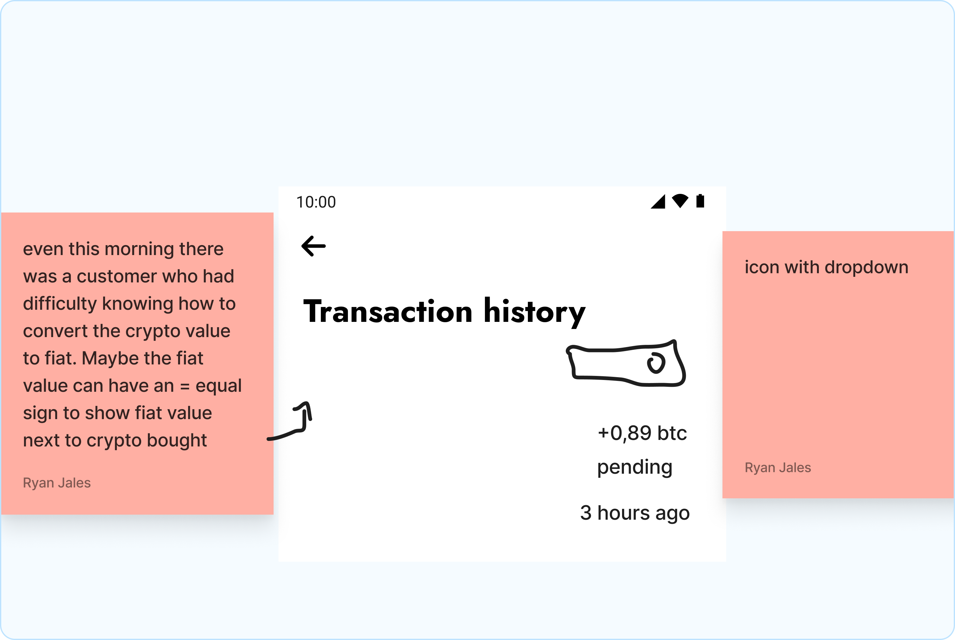
It was hard to track the status of a transaction. Why this might not matter for small volume transactions, it was very crucial for our customers moving money in volumes.
After performing a transaction they weren’t sure what was next. This led to alot of support tickets being created.
The old transaction history section
The solution upfront
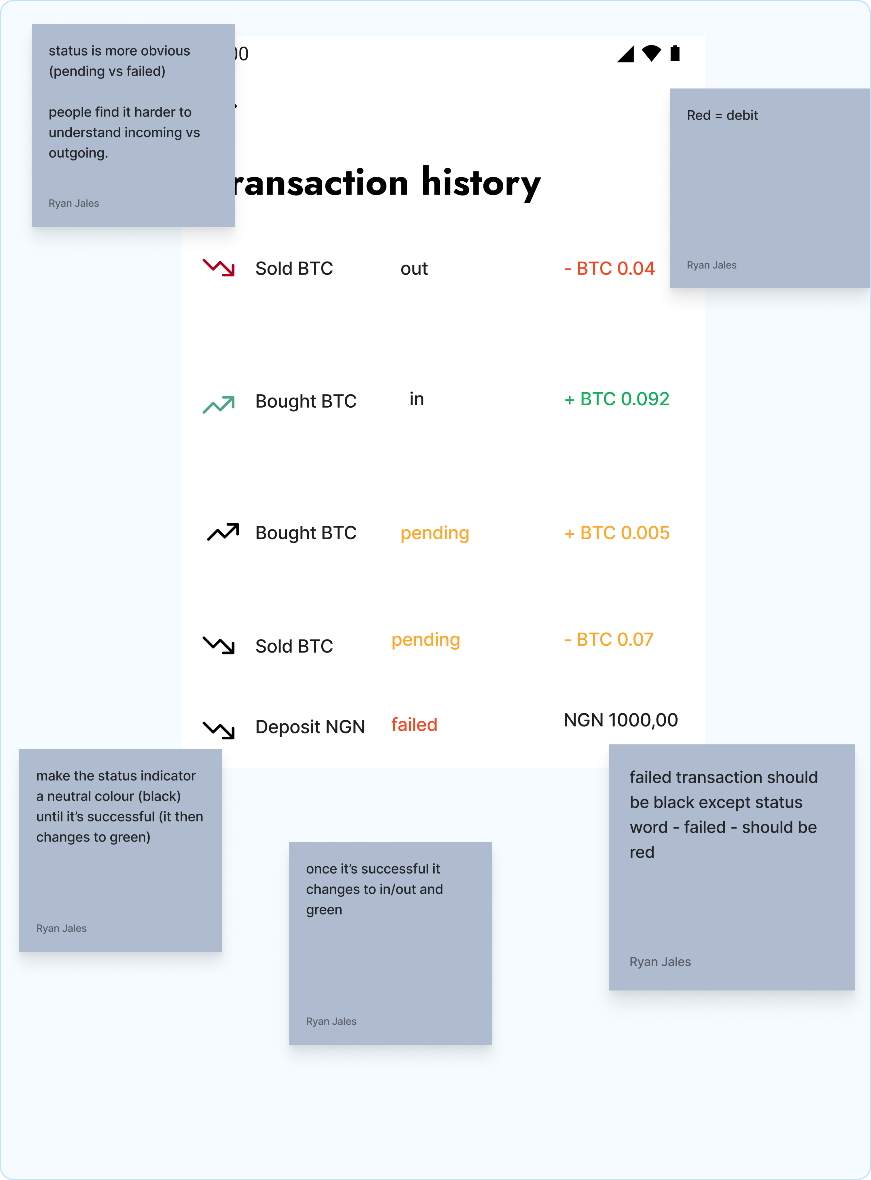
I solved this by making it clear to our customers what the status of the transaction was, and whether it was a debit or credit transaction.
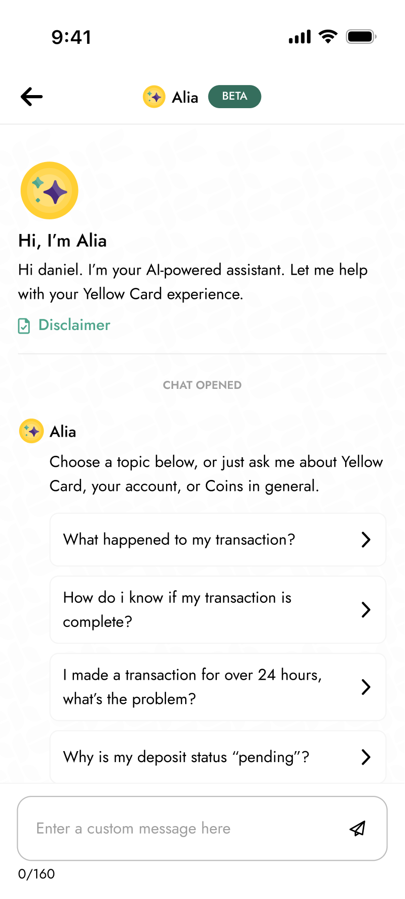
To also make sure they got as much support as possible, i included our support Ai model, Alia, to help them with quick support upfront. If there was a failure or a problem that Alia couldn’t solve, then a support ticket can be created afterwards.
Solutions upfront
How i arrived at the solution
I worked alongside our lead UX researcher to uncover user sentiment around the current transaction history design and understand what users expect it to look like.
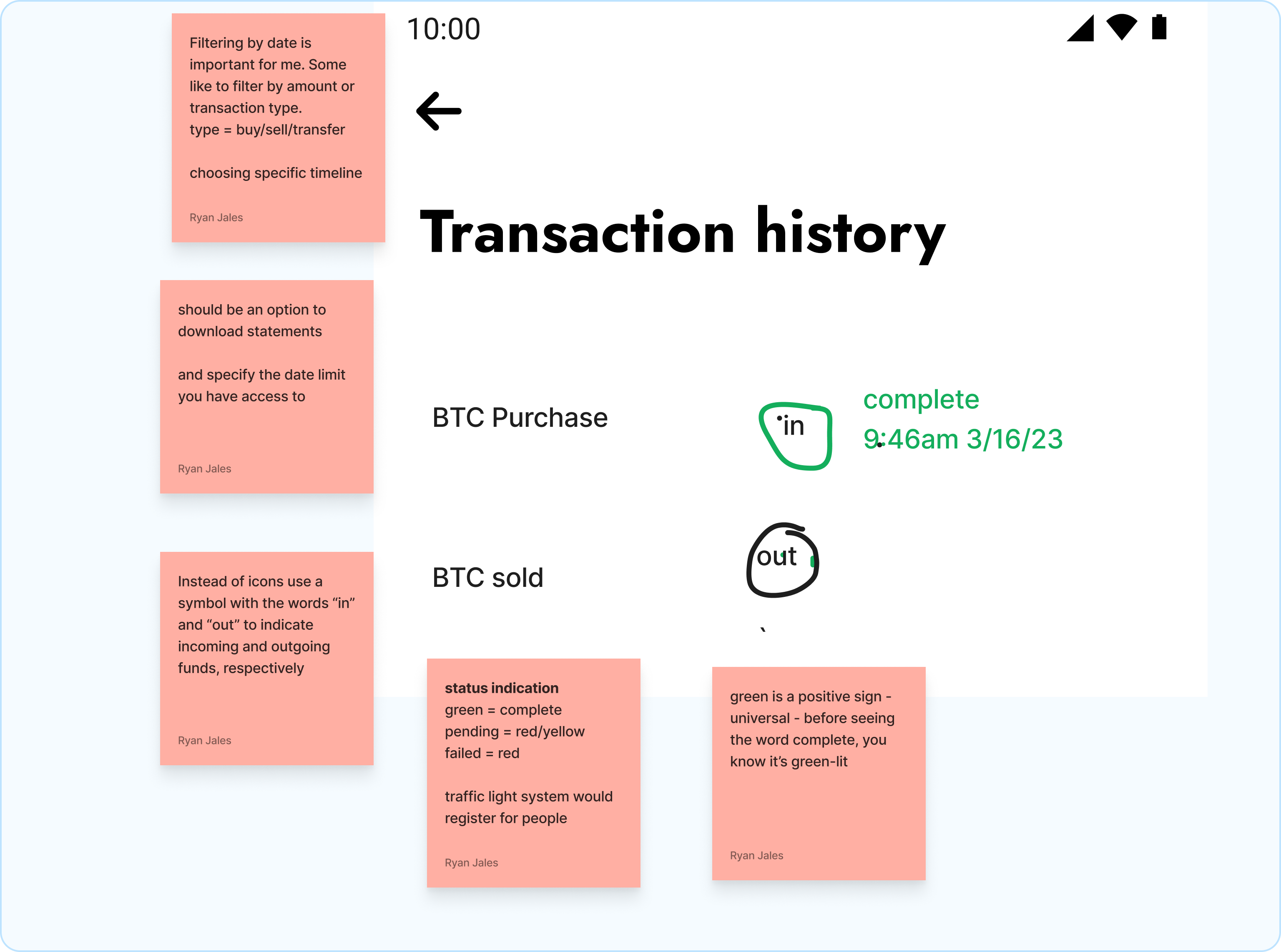
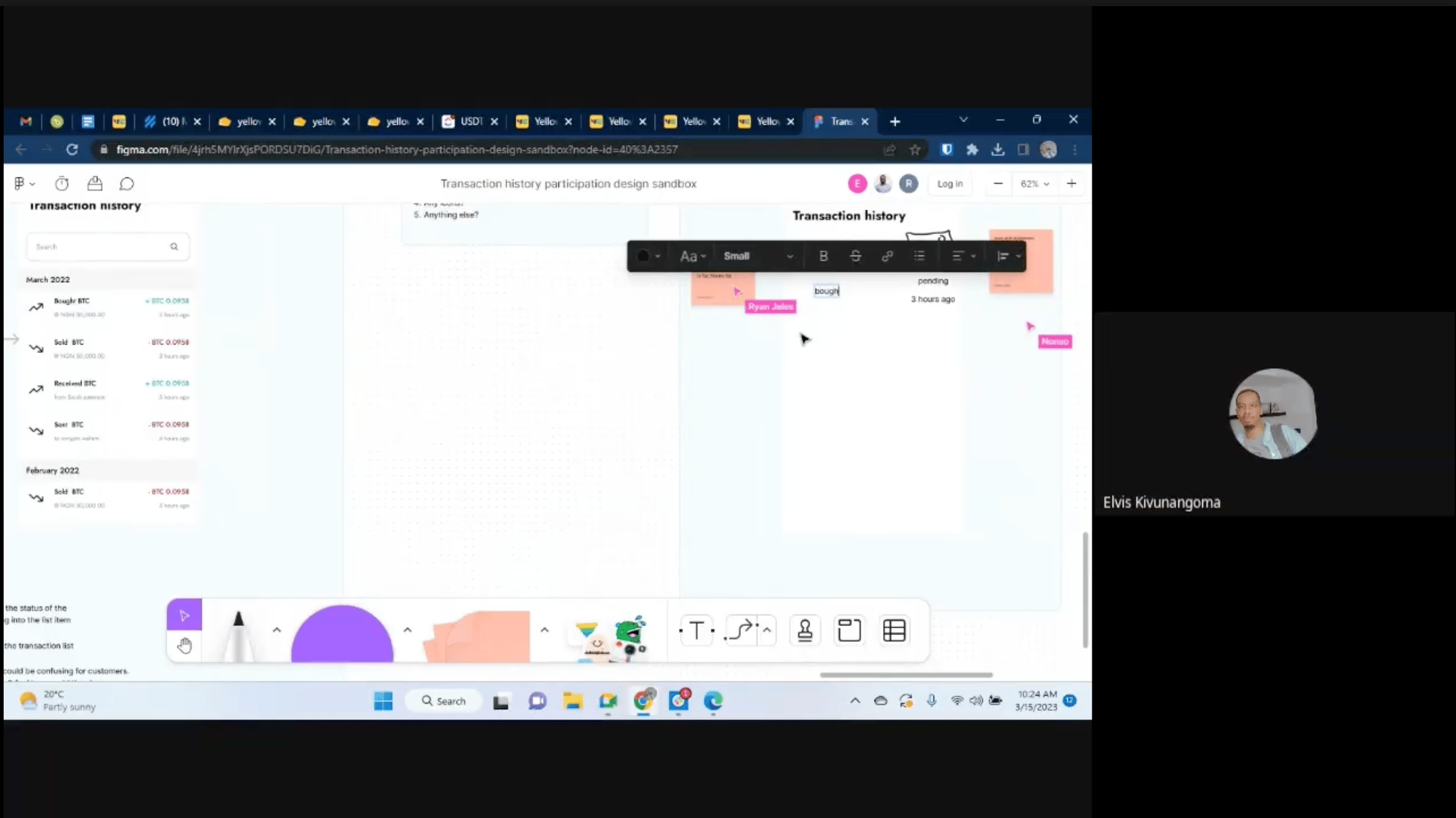
We ran a participatory design session with six customers, where they sketched their ideal transaction history list items directly in FigJam.
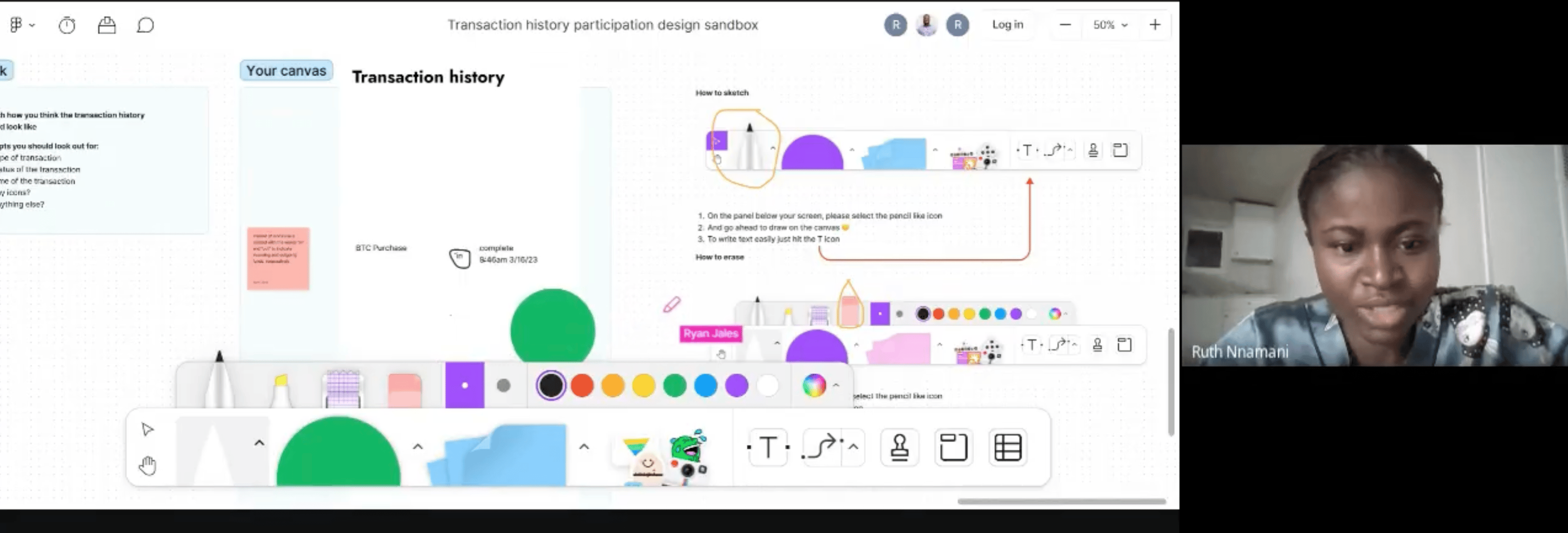
Moderated research sessions held on Figjam and Google meet
Doing this helped us notice a trend across all entries. People wanted clarity. They wanted to manage expectations per transaction right on the app by themselves, without even needing extra support from an agent.
Three things that helped redefine the whole experience
Clear transaction status and labels
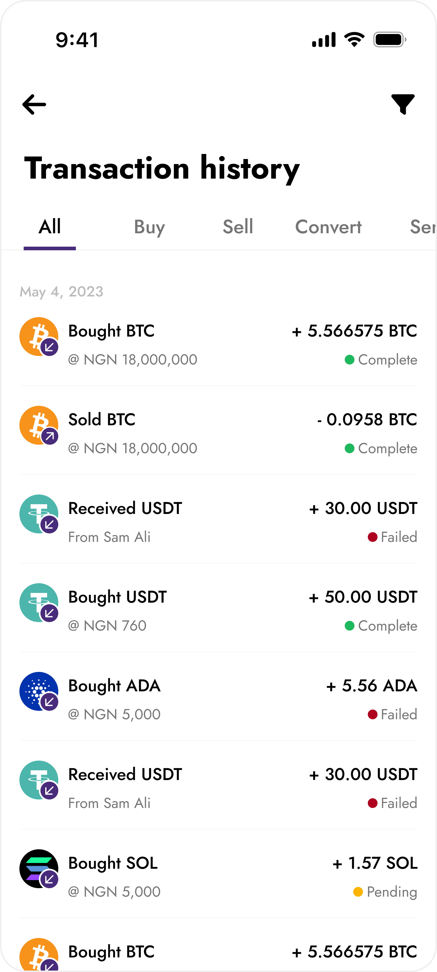
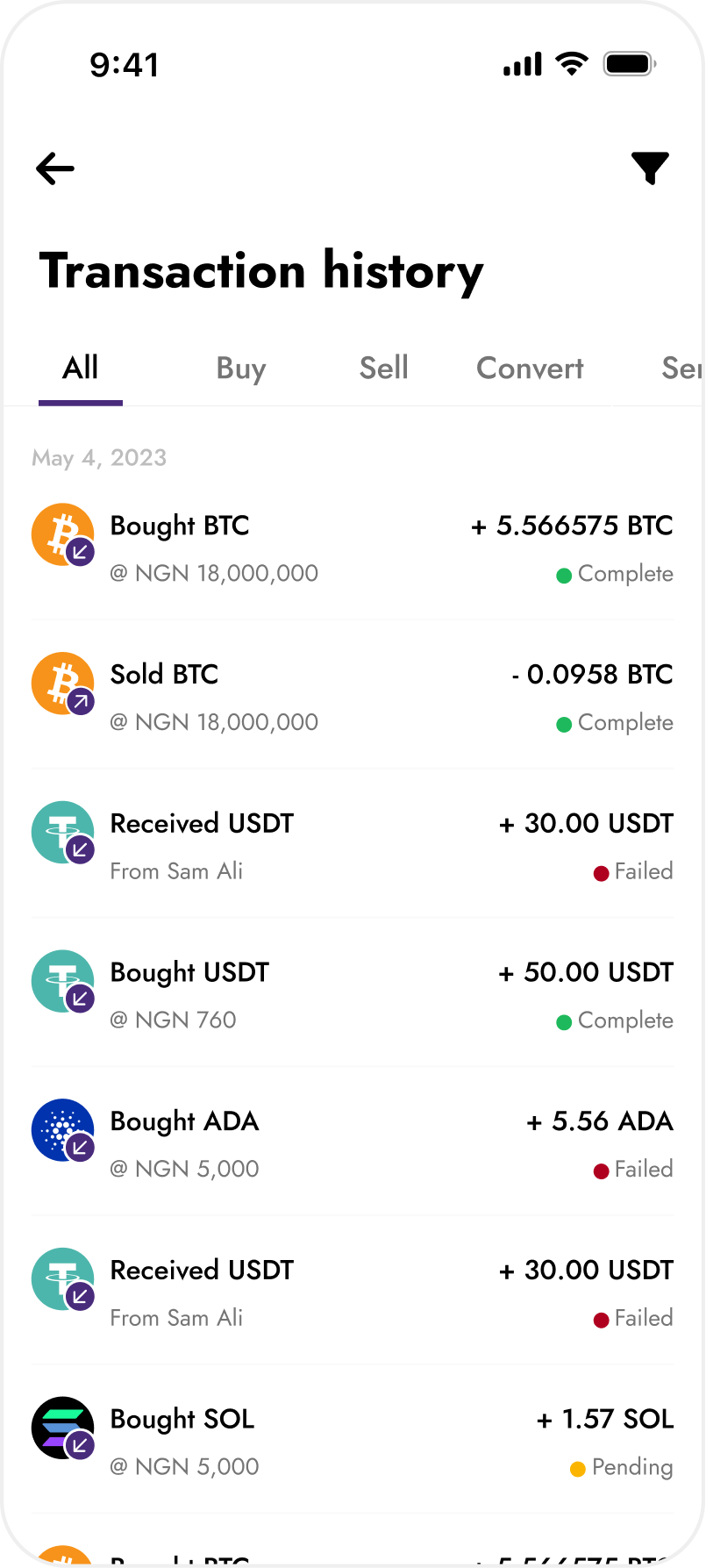
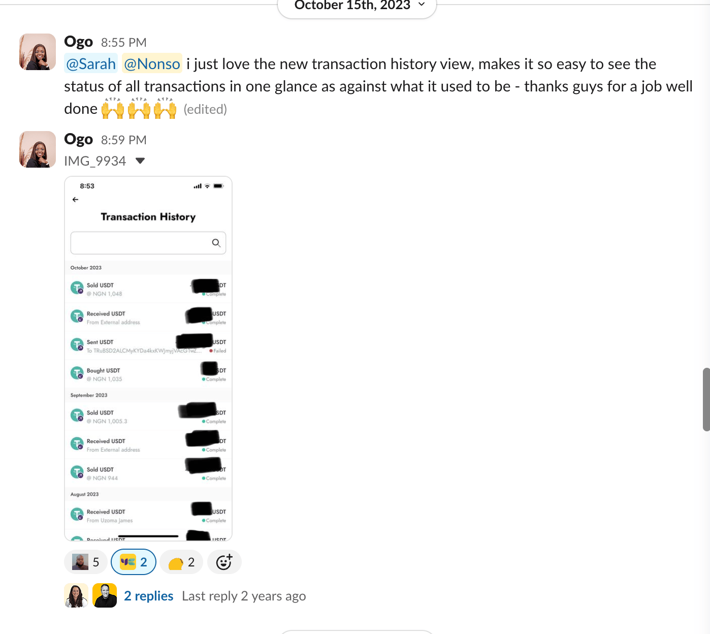
I made it clear what transaction was carried out, what exact asset and also what the status of the transaction was. The goal here was to provide as much clarity as possible upfront, and hopefully avoid them having to reach out to support for something that can be self serviced
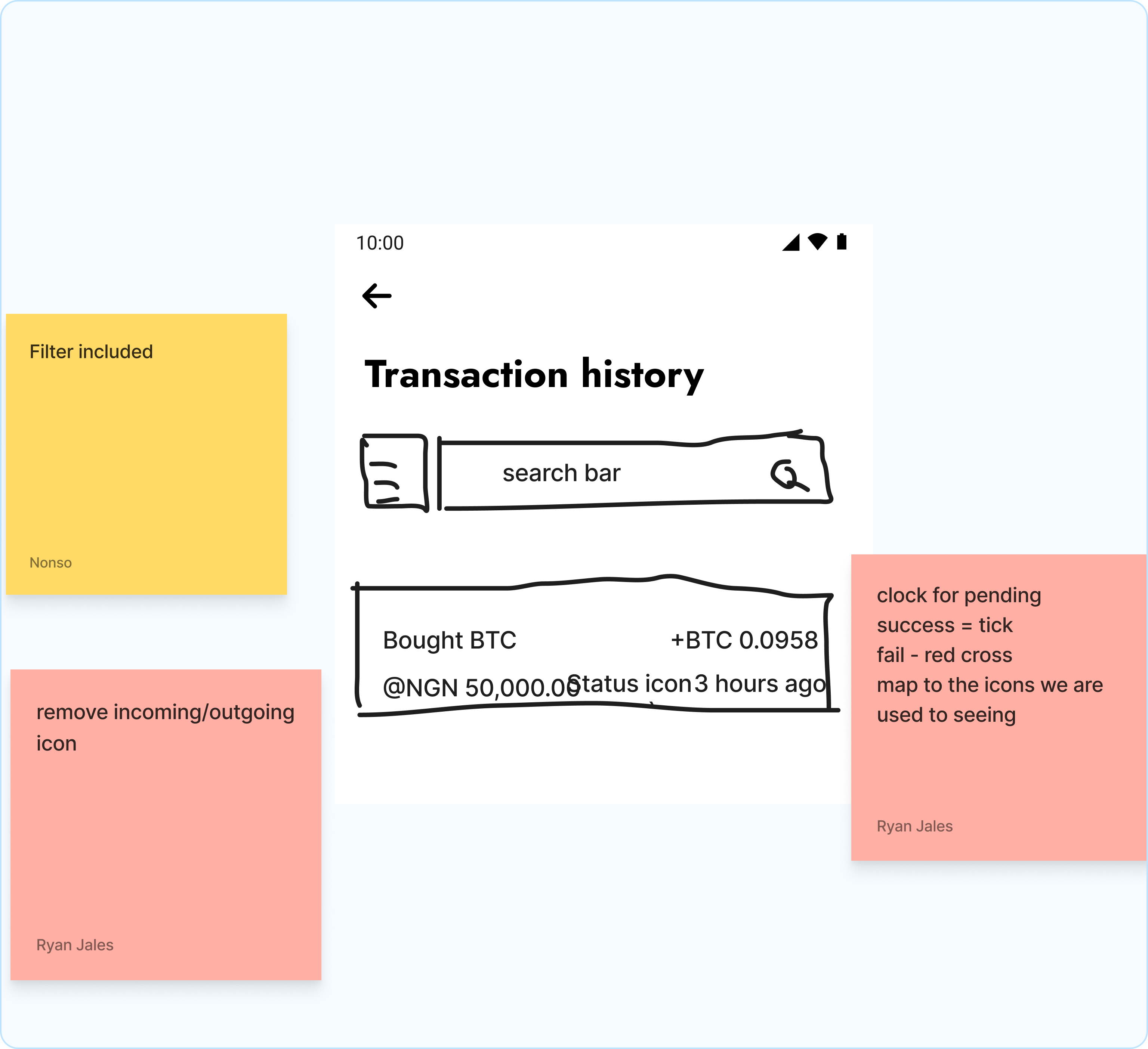
A general transactions page with filters and tabs
I designed a page where they could manage all transaction categories, filter by each transaction and also be aware what date and time each transaction was carried out. This was crucial to provide a single source of truth for all transactions
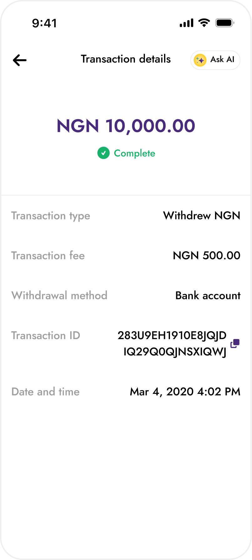
A details view showing all data according to level of priority and Ai support
I also designed a details view that had the most important things shown first, and also added our Ai chat bot, Alia.
Alia’s job was to provide customers with bite sized info about each transaction and set things up to provide as much context as possible for the support agent that might get attached afterwards from the conversation.


Results and impact
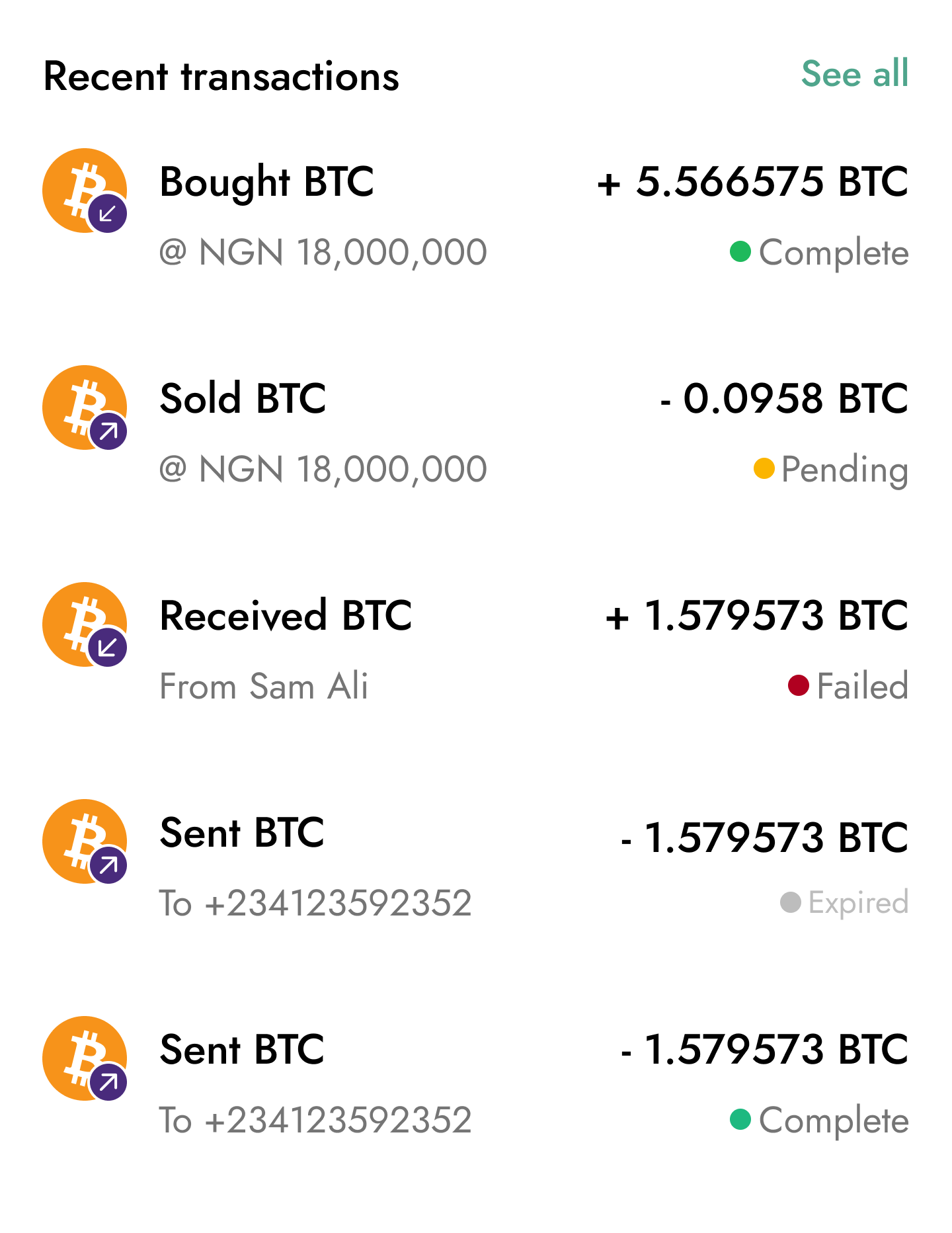
We achieved a 30% reduction in support tickets within the first month, a trend validated by Mixpanel keyword analysis showing a significant drop in transaction-related search queries.
We also got positive user sentiment.and lots of positive feedback afterwards.
Key learnings
Being user-centred is fundamental because you can’t design meaningful solutions without truly understanding the problem from the customer’s perspective.
During the participatory design sessions, I initially questioned how actionable some of the raw data would be. But I’ve learned that user research rarely comes perfectly packaged.
The value lies in interpreting signals, identifying patterns, and extracting the insights that matter most. It’s less about taking feedback at face value and more about synthesising it into clear, usable direction for the product.

Back to home
Next project
Contact me
Let’s talk about how i can bring your product idea to life. Dudumukwu@gmail.com :)
Reducing support tickets volume by 30% through a High-Clarity Transaction history redesign
Yellow Card recently launched the rebranded version of the mobile app and while it was a successfully launch, customers weren’t finding the transaction history sections useful enough. It wasn’t clear enough for them to monitor the status of their transactions and that led to a flood of support tickets.
ROLE
Lead Product Designer
TEAM MEMBERS
Ryan Jales
Head UX research and writing
TOOL STACK


The problem
It was hard to track the status of a transaction. Why this might not matter for small volume transactions, it was very crucial for our customers moving money in volumes.
After performing a transaction they weren’t sure what was next. This led to alot of support tickets being created.
The old transaction history section
The solution upfront
I solved this by making it clear to our customers what the status of the transaction was, and whether it was a debit or credit transaction.
To also make sure they got as much support as possible, i included our support Ai model, Alia, to help them with quick support upfront. If there was a failure or a problem that Alia couldn’t solve, then a support ticket can be created afterwards.
Solutions upfront
How i arrived at the solution
I worked alongside our lead UX researcher to uncover user sentiment around the current transaction history design and understand what users expect it to look like.
We ran a participatory design session with six customers, where they sketched their ideal transaction history list items directly in FigJam.
Moderated research sessions held on Figjam and Google meet
Doing this helped us notice a trend across all entries. People wanted clarity. They wanted to manage expectations per transaction right on the app by themselves, without even needing extra support from an agent.
Three things that helped redefine the whole experience
Clear transaction status and labels
I made it clear what transaction was carried out, what exact asset and also what the status of the transaction was. The goal here was to provide as much clarity as possible upfront, and hopefully avoid them having to reach out to support for something that can be self serviced
A general transactions page with filters and tabs
I designed a page where they could manage all transaction categories, filter by each transaction and also be aware what date and time each transaction was carried out. This was crucial to provide a single source of truth for all transactions
A details view showing all data according to level of priority and Ai support
I also designed a details view that had the most important things shown first, and also added our Ai chat bot, Alia.
Alia’s job was to provide customers with bite sized info about each transaction and set things up to provide as much context as possible for the support agent that might get attached afterwards from the conversation.


Results and impact
We achieved a 30% reduction in support tickets within the first month, a trend validated by Mixpanel keyword analysis showing a significant drop in transaction-related search queries.
We also got positive user sentiment.and lots of positive feedback afterwards.
Key learnings
Being user-centred is fundamental because you can’t design meaningful solutions without truly understanding the problem from the customer’s perspective.
During the participatory design sessions, I initially questioned how actionable some of the raw data would be. But I’ve learned that user research rarely comes perfectly packaged.
The value lies in interpreting signals, identifying patterns, and extracting the insights that matter most. It’s less about taking feedback at face value and more about synthesising it into clear, usable direction for the product.
Contact me
Let’s talk about how i can bring your product idea to life. Dudumukwu@gmail.com :)
Reducing support tickets volume by 30% through a High-Clarity Transaction history redesign
Yellow Card recently launched the rebranded version of the mobile app and while it was a successfully launch, customers weren’t finding the transaction history sections useful enough. It wasn’t clear enough for them to monitor the status of their transactions and that led to a flood of support tickets.
ROLE
Lead Product Designer
TEAM MEMBERS
Ryan Jales
Head UX research and writing
TOOL STACK
The problem
It was hard to track the status of a transaction. Why this might not matter for small volume transactions, it was very crucial for our customers moving money in volumes.
After performing a transaction they weren’t sure what was next. This led to alot of support tickets being created.
The old transaction history section
The solution upfront
I solved this by making it clear to our customers what the status of the transaction was, and whether it was a debit or credit transaction.
To also make sure they got as much support as possible, i included our support Ai model, Alia, to help them with quick support upfront. If there was a failure or a problem that Alia couldn’t solve, then a support ticket can be created afterwards.
Solutions upfront
How i arrived at the solution
I worked alongside our lead UX researcher to uncover user sentiment around the current transaction history design and understand what users expect it to look like.
We ran a participatory design session with six customers, where they sketched their ideal transaction history list items directly in FigJam.
Moderated research sessions held on Figjam and Google meet
Doing this helped us notice a trend across all entries. People wanted clarity. They wanted to manage expectations per transaction right on the app by themselves, without even needing extra support from an agent.
Three things that helped redefine the whole experience
Clear transaction status and labels
I made it clear what transaction was carried out, what exact asset and also what the status of the transaction was. The goal here was to provide as much clarity as possible upfront, and hopefully avoid them having to reach out to support for something that can be self serviced
A general transactions page with filters and tabs
I designed a page where they could manage all transaction categories, filter by each transaction and also be aware what date and time each transaction was carried out. This was crucial to provide a single source of truth for all transactions
A details view showing all data according to level of priority and Ai support
I also designed a details view that had the most important things shown first, and also added our Ai chat bot, Alia.
Alia’s job was to provide customers with bite sized info about each transaction and set things up to provide as much context as possible for the support agent that might get attached afterwards from the conversation.
Results and impact
We achieved a 30% reduction in support tickets within the first month, a trend validated by Mixpanel keyword analysis showing a significant drop in transaction-related search queries.
We also got positive user sentiment.and lots of positive feedback afterwards.
Key learnings
Being user-centred is fundamental because you can’t design meaningful solutions without truly understanding the problem from the customer’s perspective.
During the participatory design sessions, I initially questioned how actionable some of the raw data would be. But I’ve learned that user research rarely comes perfectly packaged.
The value lies in interpreting signals, identifying patterns, and extracting the insights that matter most. It’s less about taking feedback at face value and more about synthesising it into clear, usable direction for the product.

Contact me
Let’s talk about how i can bring your product idea to life. Dudumukwu@gmail.com :)